
What if your dashboards turn out to be misleading?
An effective dashboard is a tool for getting clear insights into your data. But what if a dashboard is less effective than imagined? Or even worse; what if your dashboards mislead users? In this blog, we discuss two new features of Power BI. One can mislead your users, while the other makes your dashboards more effective.
A highly requested solution with undesirable side effects.
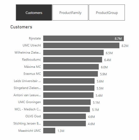
The first update we want to highlight is an update that allows small multiples to be turned off on the shared axis. A common complaint among Power BI users was “due to the shared axis, I can’t see smaller values properly anymore”. This update does make that possible, however how useful is this turning off the shared axis really?
Let’s see what happens when we turn off the shared axis.
As you can see, it is not very easy to tell which product group is the largest if the y-axes are not equal. In fact, at first glance, it all looks the same. Only when you look longer do you see that the axes are not equal.
We believe that you should always keep the axes equal, and so even if they are small values. After all, you are comparing different segments. But then how can you visualize small multiples, while also making it easy to read? It’s simpler than it sounds, take a look:

In this case, we recommend using Zebra BI, a plug-in for BI tools such as Power BI. By using this plug-in, the small multiples are placed in boxes of different sizes depending on the values. This allows users to properly compare the segments and thus draw the correct conclusion, as they are not misled by different axes. Sounds useful right?
An update that simplifies reading a report
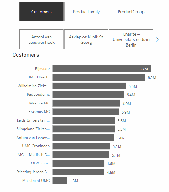
A feature from the same update that does make Power BI dashboards more effective, is the addition of Dynamic Slicers. With Dynamic Slicers, you can use field parameters to dynamically change the measurements or dimensions analyzed within a report. But why is this so useful?
With Dynamic Slicers, you can help readers of a BI report explore and customize the report, so they can use the information that is useful for their analysis. As shown in the GIF above, a user can filter by Customers, Product Family, Product Group, or other slicers that you’ve set up in the report.
In addition, you can parameterize slicers further to support dynamic filtering scenarios. In the GIF below, you can see how it works. You can see that the value comes from the dynamic slicer and changes dynamically. This gives your users even more opportunities to interact with the dashboard.
How do we make sure Dashboards are not misleading?
Of course, Microsoft continuously tries to update and improve Power BI, but some updates can have unwanted effects. We have been using IBCS standards for years as our Power BI report guidelines, and we also believe that if these standards are applied properly, you’ll prevent unintended consequences. To test if our reports comply with these standards, we use ZebraBI‘s IBCS-proof plug-in while building dashboards in PowerBI. Want to learn more about how IBCS standards can help your organization?
Learn more about IBCS reporting
Fill out this form below and find out the basics of IBCS reporting in a quick 20-minute webinar!