
Become a better admin with the Power BI Admin Dashboard
• Monitor your Power BI tenant
• Get an overview of report updates
• Gain insights of report usage
What is the Power BI Admin dashboard?
The Power BI Admin dashboard is a monitoring tool for people overseeing Power BI users. The dashboard gives you the ability to monitor everything that is going on in your organisation’s workspaces at once, all while making an accessible overview in a Power BI report. By using the data collected from the Office 365/Azure portal, a Power BI Admin can create a report using user statistics and log files.
What can it do?
- Monitor Power BI tenant, across workspaces instead of focusing on one workspace
- Monitor which Data Sources are being used on Dashboards
- Know whether you’re overpaying for your Power BI licenses
- Get insights into by whom/when/how your reports are being used
- Know when there are Datasets refreshing errors and know the distribution of refresch times across the tenant
- Get insights into how much a report is being used
- Create a quick overview of user access for each workspace
- See how many reports, dashboards, and datasets have been made
How is it different than Power BI Report Usage?
While Power BI Report Usage can only be used on a Workspace Level, the Power BI Admin Dashboard gives you full control of data on both a workspace, as well as, on a tenant level. Simply put, it gives you more insight into your organization. Additionally, the dashboard allows you to create clear visuals from table data, something you are unable to do in Power BI Report Usage. Furthermore, this dashboard gives you full insights on refresh schedules and statuses, giving you the average duration of a refresh and a detailed report about the reason why it failed. Lastly, the Power BI Admin Dashboard lets you analyse Activities from the moment you started using the dashboard, instead of only the last 30 days like in Power BI Report Usage.
What is a good use case of Power BI Admin Dashboard?
Every day at 9 in the morning you refresh a financial report and monitor its usage by members of your team throughout the day. By analyzing this, you notice two distinct peaks in activity, one at 10 in the morning and one at 9 in the evening. While the views at 10 in the morning is within normal working hours, the views at 9 in the evening certainly are not. Using the cross-filter functionality in the Power BI Admin Dashboard, you are able to check which team members are checking the financial report at which time of the day. From this view you also notice that certain team members have not been able to view the new data and you can help them out by fixing the issue. Essentially, the Power BI Admin Dashboard gives you the necessary insights for your team to perform at the top of their game.
Advantages of Power BI Admin:
- Can be managed on a tenant level
- Find clear connections between data to improve usage of the dashboards
- Shows historical data, helps to see trends
- See which users are using your reports and which users are not yet using it but do have access
- Create more insights from log files/user statistics
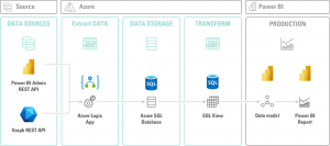
The tools that were used to create the dashboard:
- Graph APIfrom Azure
- Power BI rest API
- Logic Apps in Azure
- Azure SQL Server
- Power BI
Tools that we decided not to use:
- Azure functions
- Azure data factory
- Blob Storage
- Power Automate
While the above tools can result in a similar dashboard, the reason we choose to work with Logic Apps is because:
- Logic Apps is better suited for extracting small datasets with up to 100 rows of data. Since we do API calls that generate these smaller datasets, in our case we do an API call for each Power BI dataset in the tenant. Therefore, using Logic Apps is more cost efficient compared to other tools like Azure Data Factory that are made for transferring larger sets of data.
- Logic Apps is a low code tool, meaning that it is both easier to read and use for citizen developers compared to writing code for other tools, like Azure Functions. Additionally, understanding the logic, flow of data, and debugging/troubleshooting is easier in Logic Apps.
You can achieve the same goal of extracting data with almost every ETL tool, however Rockfeather works with Azure Cloud because of its ease of use and native integration with Power BI.
Rockfeather & The Power BI Admin dashboard
While working with customers we’ve noticed that Power BI admins were not happy about limitations in monitoring their Power BI tenant. The Power BI Admin dashboard gives Power BI admins the options to go around these limitations. First, we’ve been able to give Power BI admins the option of analyzing data from an extended period of time. Secondly, by showing non-essential licenses, we’ve been able to help Power BI admins cut down on costs. Lastly, by being able to get an overview of who was able to access reports that they shouldn’t have access to, we could improve on data security.
Within Rockfeather, we use Power BI as our BI-tool and we have several different reports published on our tenant. Using the capabilities of the Power BI Admin Dashboard we are able to check whether our data was refreshed successfully, look at the activity on different reports, and check which of our dashboards are used most often. This way, we don’t have the hassle of checking five different dashboards throughout the day, we are now able to spot which reports are most important for our team members, and we can see how our dashboards are being used over a longer period of time.
An architectural overview of the Power BI Admin Dashboard can be found below:
Or if you want to try our anonymized Power BI Admin Dashboard yourself and see which cross insights we created? You can click around in our published report:
If you want to know more about the implementation of this, please reach out to us and we’ll help you with the implementation process. We use templates and/or solutions that are easy to deploy.


Artificial Intelligence is ready!
In this interview, Jonathan Aardema talks with Prof. Eric Postma (professor of Cognitive Science and Artificial Intelligence at the University of Tilburg) about the why, how, and what of artificial intelligence applications. What do we see in practice, and what does science say about it?

Visiting London for the Tableau Partner Executive Kick-Off 2020
Every year Tableau invites its most valuable partners to kick off the new year together. The theme for this year was Accelerate, so let’s get right to the point. This exciting event was focused on three main areas.

Mastering DAX
Keeping your skills up to date is crucial when you work with the newest technology. At Rockfeather, we challenge each other to be the best version of yourself. That’s why I attended the mastering DAX course. DAX (Data Analysis Expressions) is a formula expression language. Next to Power BI, DAX is applied in Excel Power Pivot and tabular models in SQL Server. Learn it once, use it tomorrow.