Dashboards with Impact
In my eight years as a consultant, I've probably seen more dashboards than I can count. Still, most of them don't have the impact they should have. Nine out of ten times, people start looking at the data. Is there something wrong with the underlying data-sets? Or is the visual not clear enough? Looking at those elements isn't bad, but in my opinion, you're looking in the wrong direction.
Dashboards without Impact
By starting with simple questions, you’ll avoid an endless search in your data-sets asking yourself: why aren’t people listening? Why aren’t people using my dashboards? To cheer you up, you’re not the first wondering why the insights you uncovered don’t have an impact.
How IBCS started
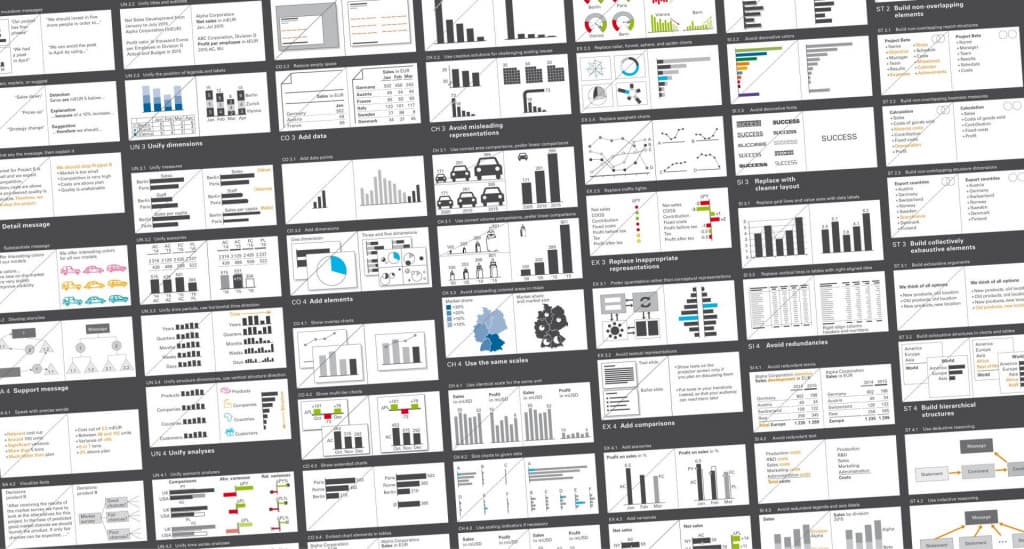
In the ’80s, a man called Rolf Hichert had the same problem. That’s why he started the IBCS (International Business Communication Standards). His motto was: If musicians can visualize a symphony with the help of sheet music, then business people should be able to find a standard notation for monthly sales. In other words: if you don’t have a standard or a language, there is a big chance people won’t understand your dashboard. And if they don’t understand it, there won’t be an impact of any kind.
How to use IBCS?
Using IBCS standards isn’t hard; you have to be consistent. We always start with the message: what is the message of your dashboard? What do you want people to remember after the meeting is over? When the message is clear, the rest comes naturally. Every great message has a great title. You want to impress when you start, so choose something to wake people up.
Timing and structure
The next step is the period. If the period is too long, people won’t see the urgency of your data. If the period is too short, then people might miss a trend that has been developing over time. So choosing the right period can be tough. It takes training and experience to make the right choices. The last step is the structure of your dashboard. Keep the IBCS structures as the red line so that people will recognize the information from the beginning to the end.
What is in it for you

Artificial Intelligence is ready!
In this interview, Jonathan Aardema talks with Prof. Eric Postma (professor of Cognitive Science and Artificial Intelligence at the University of Tilburg) about the why, how, and what of artificial intelligence applications. What do we see in practice, and what does science say about it?

Visiting London for the Tableau Partner Executive Kick-Off 2020
Every year Tableau invites its most valuable partners to kick off the new year together. The theme for this year was Accelerate, so let’s get right to the point. This exciting event was focused on three main areas.

Mastering DAX
Keeping your skills up to date is crucial when you work with the newest technology. At Rockfeather, we challenge each other to be the best version of yourself. That’s why I attended the mastering DAX course. DAX (Data Analysis Expressions) is a formula expression language. Next to Power BI, DAX is applied in Excel Power Pivot and tabular models in SQL Server. Learn it once, use it tomorrow.