
Machine Learning meets Spotify data
- Predict target audience for Spotify songs with Machine Learning
- Visualize data in Tableau dashboard
- Model deployment in the UbiOps platform
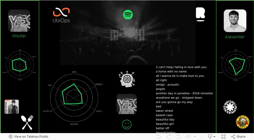
Our Spotify Dashboard
Introduction of the use case
Visualizing your data is a great way to deliver your message to your audience. Until now, data processing scripts and low-code functionality have enabled BI analysts to transform the data and filter out only the most important data. At the same time, many BI analysts are pumping up their python (or R) knowledge to apply more advanced analytics to their data and visualize it in a dashboard or low-code app. However, current BI platforms don’t always provide tools for python/R code integration and are especially not suitable for hosting machine learning code. One solution could be to use one of the major cloud providers. However, this is often easier said than done as it requires specialized knowledge of a variety of services.
In this example, we wish to predict if a new Spotify song fits better with Wouter or Alexander, our two targets. To do so, we use their Spotify playlist data to uncover their music taste.
Alexander has developed a classification model that predicts if a song belongs to Wouter’s Spotify list or that of Alexander. The model is deployed on kubernetes with an API endpoint (in UbiOps) and visualized using Tableau.
UbiOps & Rockfeather
Rockfeather makes use of Data Visualization, Data Science, and Low-Code technology to build smart solutions. Their team creates state-of-the-art solutions for their customers in various industries and functions. This is how Rockfeather embraces technology and empowers ambitious people.
UbiOps is a deployment tool built for data scientists, which allows them to deploy their code easily, with knowledge of python or R alone.
What’s the next step?
The first step in the process is about training a predictive model, which can find patterns in the data from the two targets. The Spotify datasets on the two target audiences include all characteristics of the songs they listen to. These characteristics are translated into numeric variables, so that we compare the songs to each other. The following features are used:
- BPM
- Energy
- Dance
- Valence
- Acoustic
- Pop
Before Alexander starts with the training process, he splits the dataset into training and testing sets. The training dataset is made available for multiple machine learning models to recognize patters in it. Based on this training dataset, the machine learning models look at the characteristics of the songs, in order to differentiate the music styles of Alexander and Wouter. Once the training process is done, the performance is tested on the testing dataset. This is data that the model has never seen. The algorithm-generated predictions, that is, a classification on whether a song belongs to Alex’s or Wouter’s playlist, are compared with the actual values. The predicted and actual values of the test set are visualized in the Tableau dashboard on top of this page.
After comparing different models’ performance with different parameter settings, Alexander is satisfied with the performance of the best performing model, which he saves as “rf_saved.pkl”. By doing so, he stores the model parameters and model weights, so that he can apply the model to any new data that he feeds it. The model and its predictions can now be used in practice.
Curious how to deploy this machine learning model in the UbiOps platform?
Wouter explains how to do this in UbiOps’ technical blog. Would you like to know more about Machine learning or Data Science, please scroll down and sign-up for a free discovery session. In this discovery session we will take a look at your business’ most potential use cases.
This blog has been written by Alexander Mik (Rockfeather) and Wouter Hollander (UbiOps)
FREE: Data Science Discovery Session
Are you curious about how data science can help your organization? During this free discovery session, we will take a look at your business' most potential use cases.
Thank you!
Artificial Intelligence is ready!
In this interview, Jonathan Aardema talks with Prof. Eric Postma (professor of Cognitive Science and Artificial Intelligence at the University of Tilburg) about the why, how, and what of artificial intelligence applications. What do we see in practice, and what does science say about it?

Visiting London for the Tableau Partner Executive Kick-Off 2020
Every year Tableau invites its most valuable partners to kick off the new year together. The theme for this year was Accelerate, so let’s get right to the point. This exciting event was focused on three main areas.

Mastering DAX
Keeping your skills up to date is crucial when you work with the newest technology. At Rockfeather, we challenge each other to be the best version of yourself. That’s why I attended the mastering DAX course. DAX (Data Analysis Expressions) is a formula expression language. Next to Power BI, DAX is applied in Excel Power Pivot and tabular models in SQL Server. Learn it once, use it tomorrow.