
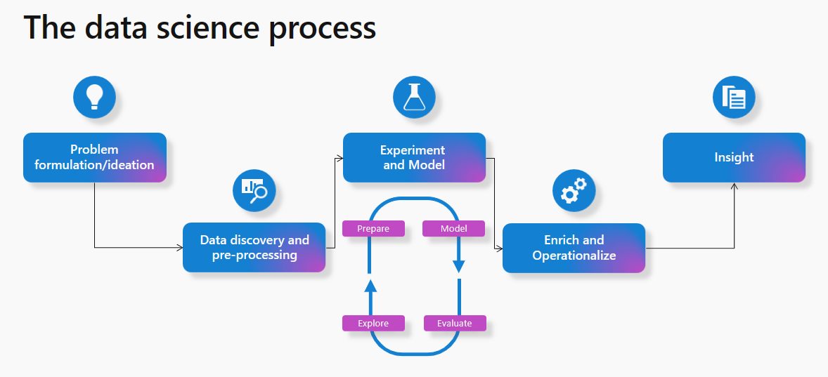
Data Science in Microsoft Fabric
Microsoft Fabric is a platform that offers Data Science solutions to empower users to complete end-to-end data science workflows for data enrichment and business insights. The platform supports a wide range of activities across the entire data science process, from data exploration, preparation, and cleansing to experimentation, modeling, model scoring, and serving predictive insights.
The typical data science process in Microsoft Fabric involves the following steps:
- Problem formulation and ideation: Data Science users in Microsoft Fabric work on the same platform as business users and analysts, which makes data sharing and collaboration seamlessly between different roles.
- Data Discovery and pre-processing: Users can interact with data in OneLake using the Lakehouse item. There are also tools available for data ingestion and data orchestration pipelines.
- Experimentation and ML modeling: Microsoft Fabric offers capabilities to train machine learning models using popular libraries like PySpark (Python), SparklyR (R), and Scikit Learn. It also provides a built-in MLflow experience for tracking experiments and models.
- Enrich and operationalize: Notebooks can handle machine learning model batch scoring with open-source libraries for prediction, or the Microsoft Fabric scalable universal Spark Predict function.
- Gain insights: Predicted values can easily be written to OneLake, and seamlessly consumed from Power BI reports.
Business case:
The financial department of your organization already uses Power BI within Fabric to visualize their data. Now, they would like to use machine learning to generate a cashflow forecast. The data is already in a Lakehouse in OneLake and does therefore not have to be moved or copied. It can directly be used in Synapse Data Science to preprocess the data and perform exploratory data analysis using notebooks. Then, model experimentation can start within the notebooks, tracking important metrics using the built-in MLflow capabilities. After landing on a model that performs well, a cashflow forecast can be generated and written back to the Lakehouse, ready to be visualized within Power BI. The notebooks can then be scheduled to automatically generate a monthly cashflow forecast.
Synapse Real-Time Analytics in Fabric
Microsoft Fabric can also serve as a powerful tool for real-time data analytics, featuring an optimized platform tailored for streaming and time-series data analysis. It is thoroughly designed to streamline data integration and facilitate rapid access to valuable data insights. This is achieved through automatic data streaming, indexing, and data partitioning, all of which are applicable to various data sources and formats. This platform proves to be particularly well-suited for organizations seeking to elevate their analytics solutions to a larger scale, all the while making data accessible to a diverse spectrum of users. These users span from citizen data scientists to advanced data engineers, thus promoting a democratized approach to data utilization.
Key features of Real-Time Analytics include:
- Capture, transform, and route real-time events to various destinations, including custom apps.
- Ingest or load data from any source, in any data format.
- Run analytical queries directly on raw data without the need to build complex data models or create scripting to transform the data.
- Import data with by-default streaming that provides high performance, low latency, high freshness data analysis.
- Work with versatile data structures including query structured, semi-structured, or free text.
- Scale to an unlimited amount of data, from gigabytes to petabytes, with unlimited scale on concurrent queries and concurrent users.
- Integrate seamlessly with other experiences and items in Microsoft Fabric.
Want to know more about Microsoft Fabric?
Want to know more about Microsoft Fabric as a service? On October 26 we’re organizing a Fabric Masterclass that dives deep into different Fabric use cases for Data Science, Data Engineering, and Data Visualisation.
Want to know more about Microsoft Fabric
Data Visualization in Microsoft Fabric
By seamlessly integrating with Power BI, Microsoft Fabric revolutionizes how you work with analytics.
Data Engineering in Microsoft Fabric
In Microsoft Fabric, data engineering plays a pivotal role to empower users to architect, construct, and upkeep infrastructures that facilitate seamless data collection, storage, processing, and analysis for their organizations.
Data Visualization in Microsoft Fabric
By seamlessly integrating with Power BI, Microsoft Fabric revolutionizes how you work with analytics.
There are several benefits to choosing Fabric on top of Power BI. Here are some points that highlight the advantages:
- Effective Data Accessibility: Microsoft Fabric promotes the concept of having easy access to a unified and centralized data environment (One Lake). As the name suggests, it is a single storage account for all your data, logical “Data Lake” backing all your Fabric workloads. It is the storage account for all your data used in Fabric. This way, the centralized information data can be analyzed and interpreted from multiple sources in a faster and more efficient way to make informed decisions and create valuable insights.
- Data Governance: Microsoft Fabric provides robust data governance capabilities, ensuring that the data is accurate and reliable. This promotes data integrity, compliance and proper data stewardship, enabling analysts to show trustworthy and high-quality data in reports.
- Integration with Business Intelligence Tools: Microsoft Fabric integrates popular business intelligence tools, such as Power BI. This integration empowers leveraging BI skills and work within preferred toolsets whilst still benefiting from the unified data environment.
- Collaborative Analytics: The ability to share visualized data and insights with stakeholders across the organization promotes a data-driven culture and facilitates better decision-making throughout the business.
- Self-Service Analytics: Microsoft Fabric empowers self-sufficient analysis. The platform’s intuitive interfaces and self-service capabilities realizes independent access, manipulation and data analyzation, reducing our reliance on IT teams for data-related tasks.
Copilot
Co-Pilot is an AI-powered capability that plays a significant role on this topic because it helps on the following:
- Create insights and report generation
- Create narrative summaries
- Help writing and editing DAX calculations
This means that you will have the flexibility to, via natural language, look at and analyze any data in any way to gain new insights.
Business case:
Imagine, that you need to create a Sales Report and you are not sure how to translate it into analysis, you can simply write a question on Co-Pilot such as:
“Build a report summarizing the sales growth rate of the last 2 years”
With this simple question, Co-Pilot will retrieve suggestions that answer your needs! It is able to suggest new visuals, implement changes or create drilldowns to existing visuals or even design complete report pages from scratch.
More updates on the horizon
It is expected that Fabric will continue to evolve by integrating more technologies and features. This will ensure that Power BI remains a robust and versatile tool that gives its users more opportunities to create insights and make data-driven decisions.
Want to know more about Microsoft Fabric?
Want to know more about Microsoft Fabric as a service? On October 26 we’re organizing a Fabric Masterclass that dives deep into different Fabric use cases for Data Science, Data Engineering, and Data Visualisation.
Want to know more about Microsoft Fabric?
Data Science in Microsoft Fabric
Microsoft Fabric is a platform that offers Data Science solutions to empower users to complete end-to-end data science workflows for data enrichment and business insights. The platform supports a wide range of activities across the entire data science process, from data exploration, preparation, and cleansing to experimentation, modeling, model scoring, and serving predictive insights.
Data Engineering in Microsoft Fabric
In Microsoft Fabric, data engineering plays a pivotal role to empower users to architect, construct, and upkeep infrastructures that facilitate seamless data collection, storage, processing, and analysis for their organizations.

Boost your business efficiency with lowcode
In the fast-paced and highly competitive world of business, standing out is no longer just a desire, but a necessity. That’s exactly why organizations are constantly seeking innovative solutions to streamline their processes and increase efficiency. Traditionally, organizations leverages hardcore-IT in order to become more efficient. However, this solution is time-consuming and, more important, IT-talents are a rare find. This combination often results in a flooding backlog and a business having a hard time to stand out. If you are looking for a game-changing solution that can boost your business’s efficiency and productivity, lowcode might be your answer.
At the end of 2025, 41% of all employees – IT-employees not calculated – will be able to independently develop and modify applications. – Gartner, 2022
What is lowcode?
Low-code is a development approach to application development. It enables developers of diverse experience levels to create applications for web and mobile, using drag-and-drop components. These platforms liberate non-technical developers from the need to write code, while still receiving assistance from seasoned professionals. With lowcode we develop applications within a fraction of the time it usually took. But you can do a whole lot more with lowcode. For example, you don’t always need to create a completely new application. Sometimes, rebuilding a part of a slow, outdated or complicated application to a more stable and smarter version is a better option. Or you can harness the power of low-code technology to creatively link previously unconnected systems or merge various data sources in innovative ways. By doing so, you can utilize lowcode to create new data and insights you never expected.
Why use lowcode?
There are several reasons to start lowcode development today rather than tomorrow. Let me explain the best arguments:
- Rapid development
By using drag-and-drop interface and pre-built components, you can speed up application delivery 40% / 60% faster compared to traditional code. - Relieve pressure on IT staff
Lowcode allows business users to develop applications themselves. This means that citizen developers can develop and maintain applications while your IT-staff can focus on their own tasks. - Easy integration
Lowcode platforms offer pre-built connectors and API’s, enabling smooth integrations between various applications. - Enhanced user experience
Whether it is developers, business analysts or subject matter experts, everybody can contribute to the application development process. Break down silos, foster teamwork, and unlock the full potential of your workforce. Co-create an app that makes your colleagues happy. - Cost Saving
Low-code platforms reduces costs by accelerating development, minimizing the need for specialized developers, and eliminating the need for extensive coding. Achieve more with less! - Increased agility
With the ability to make changes on the fly, you can respond swiftly to feedback, market shifts, and emerging opportunities.
An example of lowcode at its bests
Before the COVID-19 pandemic, most companies did not have a desk reservation system in place, and employees would simply choose any available desk. However, with the arrival of COVID-19 and the need for social distancing, many companies began to see the advantages of a desk-reservation system.
While it could take more than a month to build such desk-reservation system leveraging traditional code, lowcode solutions solved this challenge within two weeks – from initial idea to go-live.
Build it fast, build it right, build it for the future
As with traditional development, it is important to make sure you build your lowcode solutions right. It means that because your development approach is much faster, it is especially important to maintain the best practices to keep control over your lowcode landscape. For example, you don’t want:
- Duplicate code, apps or modules
- Uncontrollable sprawl of applications
- Data Exposure
- A bad fit between processes and applications
To summarize: think before you start. Ultimately, governance empowers businesses to maximize the benefits of lowcode development while mitigating risks and ensuring long-term success.
Lowcode vs No-code
Although lowcode and no-code have a really different approach in accelerating software development, they are often grouped under the same concept. This is a common misconception because both approaches bring different pros and cons to the table. Simply put, both lowcode and no-code aim to speed up development and reduce the reliance on traditional coding practices, but the difference is in how much coding is possible with either of the two approaches.
As explained in this blog, lowcode still requires some coding, but the complexity is reduced. No-code development on the other hand, eliminates the need for coding altogether by providing a drag-and-drop interface to create applications using pre-built blocks. It focuses on empowering non-technical users to build applications. The main difference between lowcode and no-code is that lowcode accelerates ‘traditional’ development by giving the user a lot of customization options with little performance drain, while no-code is even faster for development. However, by developing faster, you trade in some performance and customization options.
Lowcode and no-code at Rockfeather
At Rockfeather we aim to develop the best applications for our customers. Therefore, we primarily use lowcode to build quality solutions. Depending on the challenge, we decide if Microsoft PowerApps or Outsystems is a better fit for you. OutSystems is a lowcode platform that offers advanced customizations and scalability. OutSystems promises to help developers build applications that are 4-10 times faster compared to traditional development, without trading in performance. PowerApps, the other platform that we offer, is a tool that has lowcode and no-code capabilities. The platform allows its users to create applications with little to no coding experience. PowerApps has a visual development interface (no-code), but also offers the option for more experienced developers to extend functionalities through custom code (lowcode).
Are you interested in knowing more about lowcode? And do you want to know more about the differences between PowerApps and OutSystems? Than subscribe to our webinar that deep-dives into the unique features of both platforms.

Deep Dive Outsystems vs PowerApps - Webinar
In this webinar, our experts compare the two solutions on four aspects. In about 30 minutes, you will learn the difference between Power Apps and Outsystems. Don’t miss out and sign up for this Deep Dive!

Webinar: What are the conclusions on the 2023 Gartner Magic Quadrant on Analytics & Business Intelligence?
Looking for a Data Visualization solution? The Gartner Magic Quadrant on BI tools, is a report of a whopping 125 pages that lists all the platforms. Are you having a hard time dissecting every detail in the report? Don't worry, our experts delved into every little detail!
BI Professionals always look forward to the Gartner Magic Quadrant for Business Intelligence & Analytics, since it’s one of the leading studies in the BI space. But how do you get the essentials from this 125-page report? And how independent and reliable is Gartner’s research really? What are the most important trends in Business Intelligence for 2023?
In about half an hour, our experts bring you up to speed on the most important findings of the new Gartner Magic Quadrant. We also discuss the most important trends for the coming year.
What will you learn in this webinar?
- The key takeaways from the Gartner Magic Quadrant for Business Intelligence & Analytics report
- Most interesting new insights for the coming year

Watch the webinar!
By filling in this form you will be able to access the webinar immediately.
Watch this webinar now!

Webinar: What are the best Data Engineering tools of 2023?
What are the best Data Engineering tools of 2023? Every year, BARC publishes a report featuring various Data Engineering technologies and evaluates these tools on various aspects. In half an hour, we'll be breaking down the most interesting aspects of this report and bring you up to speed on the latest trends.
Within Data Engineering, there are various technologies that you can use within your organization. But which technologies keep up with developments, and what are the latest trends in the Data Engineering space?
Every year, BARC writes a data management summary with various technology and reviews them on different aspects. We reviewed this report for you and will tell you all the interesting details. Fill out the form below and know the most interesting trends and technologies in the field of Data Engineering.
What will you learn in this webinar?
- The key takeaways from the BARC report
- Most interesting new insights

Watch the webinar
Watch the webinar

Webinar: What are the best Low Code apps in 2023?
Looking for a low-code way to do application development? The Gartner Magic Quadrant on Low Code platforms is a report of, a whopping 125 pages that lists all the platforms. Are you having a hard time dissecting every detail in the report? Don't worry, our experts delved into every little detail!
In the report “Magic Quadrant for Enterprise Low-Code Application Platform,” Gartner explains the differences between various Low Code platforms. But how do you get the important information from this 125-page report? Luckily, you don’t have to do this yourself. In half an hour, our Low Code specialist will update you on the most important developments and trends for the upcoming year.
What will you learn in this webinar?
- The key takeaways from Gartner’s report: Magic Quadrant for Enterprise Low-Code Application Platform
- Most interesting new insights
Watch the webinar
You can now watch the webinar!


Databricks for Data Science
Picture this: your business is booming, and you need to make informed decisions quickly to stay ahead of the competition. But forecasting can be a tedious and time-consuming process, leaving you with less time to focus on what’s important. That's where Azure Databricks comes in! We used this powerful technology to automate our internal forecasting process and save precious time. In this blog post, we'll show you the steps we took to streamline our workflow and make better decisions with confidence. So make yourself a coffee and enjoy the read!
Initial Setup
Before we dive into the nitty-gritty of coding with Databricks, there are a few important setup steps to take.
First, we created a repository on Azure DevOps, where we could easily track and assign tasks to team members, make comments on specific items, and link them to our Git commits. This helped us stay organized and focused on our project goals.
Next, we set up a new resource group on Azure with three resources: Azure Databricks Services, a blob storage account, and a key vault. Although we already have clean data in our Rockfeather Database (thanks to our meticulous data engineers), we wanted to keep our intermediate files separately in this resource group to ensure version control and maintain a clean workflow. Within our blob storage, we created containers to store our formatted historical actuals, exogenous features, and predictions.
Finally, we sketched out a high-level project architecture to get a bird’s-eye view of the project. This helped us align on our deliverables and encouraged discussion within the team about what a realistic outcome would look like. By taking these initial setup steps, we were able to hit the ground running with Databricks and tackle our forecasting process with confidence.
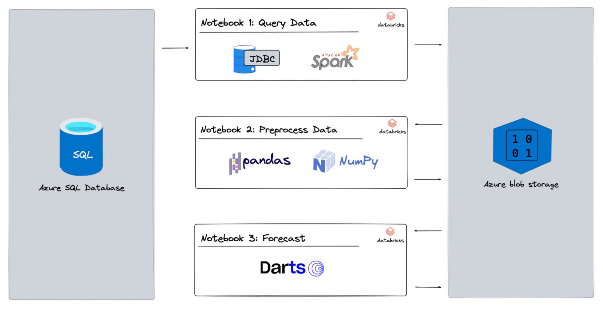
Project Architecture
Moving on to Databricks
Setting up Azure Databricks
Now we’re ready to dive into Databricks and its sleek interface. But before we start coding, there are a few more setup steps to take.
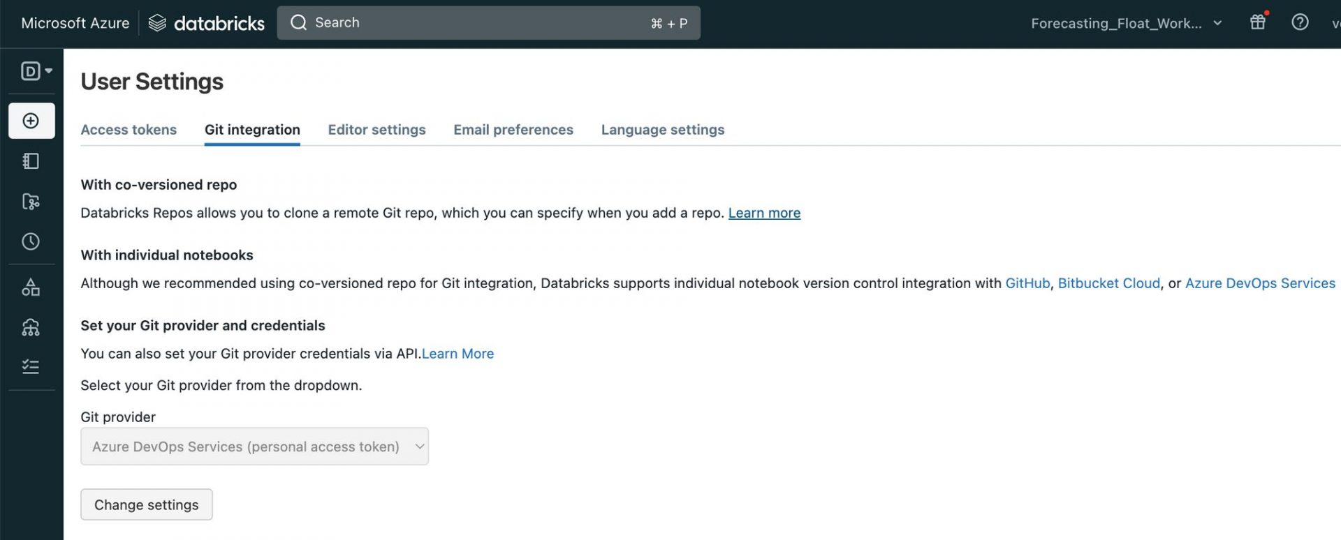
First, we want to link the Azure DevOps repo we set up earlier to Databricks. Kudos to Azure Databricks, the integration between these two tools is seamless! To link the repo, we simply go to User Settings > Git Integration and drop the repo link there. For more information, check out this link.
To keep our database and blob storage keys and passwords secure, we use the key vault to store our secrets, which we link to Databricks. You can read more about that here!
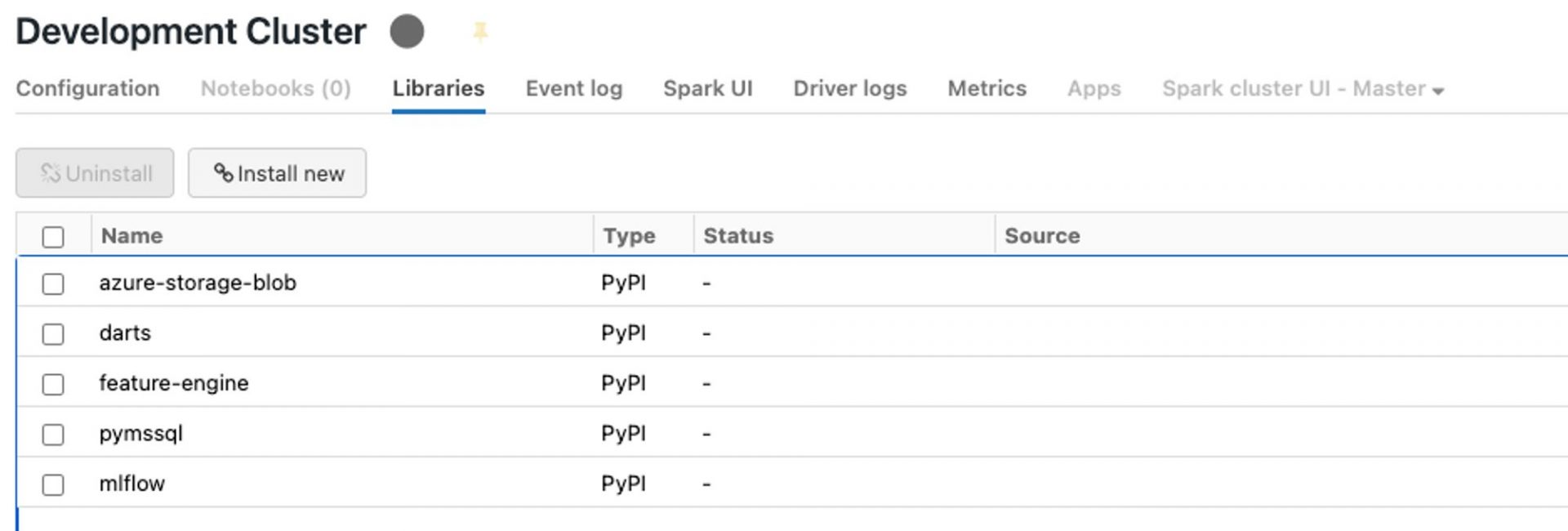
Lastly, we need to create a compute resource that will run our code. Unlike Azure Machine Learning, Databricks doesn’t have compute instances, only clusters. While this means it takes a minute to spin up the cluster, we don’t have to worry about forgetting to terminate it since it automatically does so after a pre-defined time period of inactivity! It’s also super easy to install libraries on our compute: just head over to the Libraries tab and click on “⛓️ Install new”!
From Database Query to Forecast
Now that our setup is complete, we move on to using Databricks notebooks for data loading, data engineering, and forecasting. We break this down into three sub-sections:
- Query Data: We create a notebook which reads the formatted data from the blob storage containers we created earlier. We then transform this data and create data frames for further data engineering.
- Preprocess Data: Here, we perform data cleaning, feature engineering, and data aggregation on our data frames to get them into a shape suitable for forecasting. This is also the place to apply transformations such as normalisation, scaling, and one-hot encoding to prepare our data for modelling.
- Forecast: We use machine learning models such as Random Forest, Gradient Boosting, and Time Series models to forecast future values based on our prepared data. For our baseline model, we use the classic Exponential Smoothing model. We then store these predictions back in our blob storage for further analysis and visualisation.
By breaking down the process into these three sub-sections, we can work more efficiently and focus on specific tasks without getting overwhelmed. As shown in the Project Architecture above, each step is one notebook. Let’s have a closer look at each notebook.
Notebook 1: Query Data
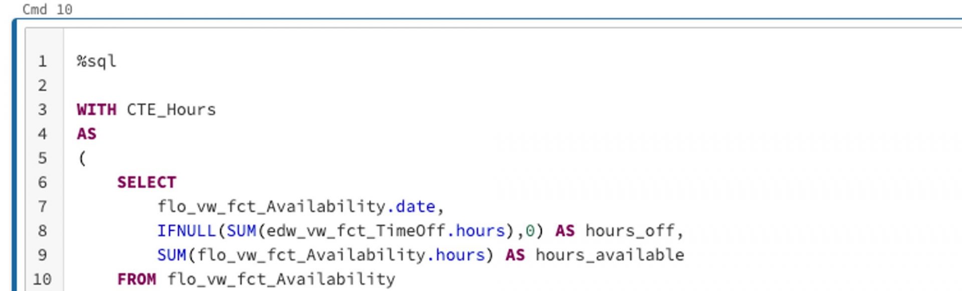
The code we’ll be writing in Databricks is pretty much in standard notebook format, which is familiar territory to all data scientists. Our data engineers in the audience will also appreciate that we can write, for example, SQL code in the notebook. All we have to do is include the %sql magic command (link: https://docs.databricks.com/notebooks/notebooks-code.html) at the beginning of the cell, as shown below. We use this approach for our first notebook, where we query the data we need. In our case here, it’s past billable hours and the available hours of our lovely consultants. Once we have the data we need, aggregated to the right level, we save it in our blob storage for the next step.
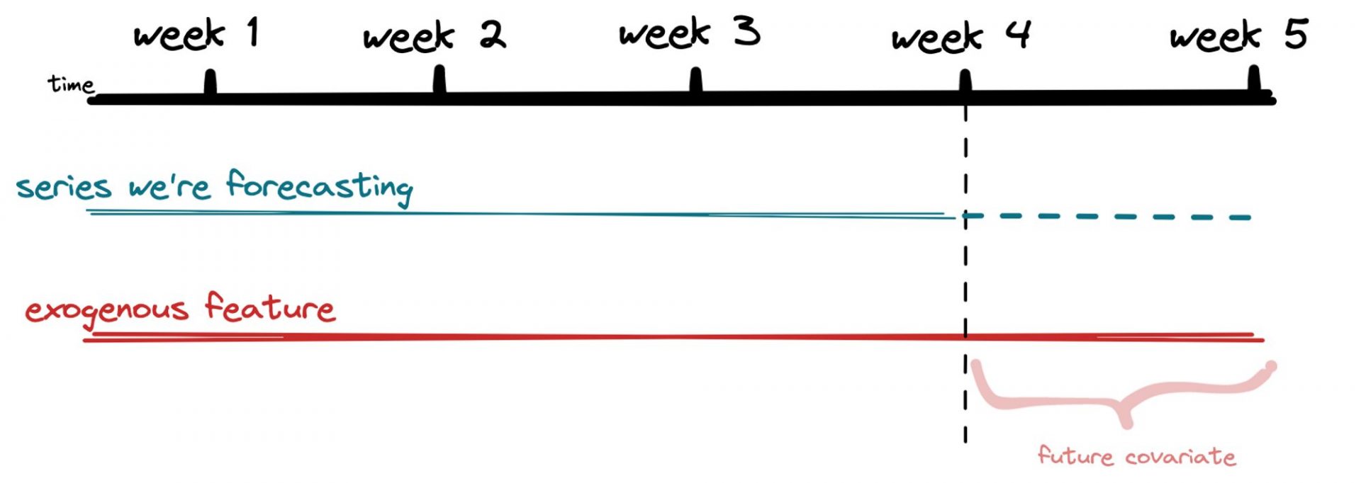
Notebook 2: Preprocess data
In Notebook 2, we use pandas and numpy to preprocess our data and do our feature engineering. We need to make sure we have all the data on the features we’ve identified for the whole forecast period before we start training any models. For example, if we’re forecasting billable hours and using total available hours of our consultants as an exogenous feature, we need to have that data available for the entire forecast period. While this may seem obvious in this case, it’s an important step to take before we jump into any modelling! Once we’ve got our data formatted the way we want it, we save it back to blob storage and move on to the next notebook.
Notebook 3: Forecast
Here’s where the magic happens – we finally get to do some forecasting! We use the darts package to train multiple models and compete against our baseline Exponential Smoothing Model. We love this package because it’s super easy to use and makes backtesting a breeze. To evaluate model accuracy, we use the mean absolute percentage error (MAPE) – it’s a simple metric that’s easy to understand.
We try out different models like linear regression, random forest, and XGBoost and compare their performance against our baseline. Our baseline model had an MAPE of 44%, which isn’t great, but we’re not deterred. By adding in our single exogenous feature and leveraging our three ML models, we were able to decrease our MAPE to 12% – a huge improvement! And of course, we save our results back to blob storage for future reference.
With our forecasting pipeline up and running in Databricks, we can sit back and watch the predictions roll in. It’s amazing what you can do with a little data and a lot of creativity!
💡 Forecast backtesting is a method used to check how accurate a forecast is by comparing its predictions with what actually happened. This helps identify any errors or biases in the forecasting model, which can be used to improve future predictions. It’s a useful tool in many industries, such as finance or weather forecasting, and helps decision-makers make better-informed decisions.
Our thoughts on Databricks
We have got to give props to Databricks, it’s a tool that makes our lives easier. It’s like having a Swiss army knife in your pocket – it’s slim, versatile, and gets the job done. We love the collaboration feature – we can code with our team, and it’s like a real-time jam session. Plus, setting up and scheduling pipelines is as smooth as butter. The best part is the seamless integration with mlflow and PySpark – it’s like having your favorite sauce on your favorite dish. Let’s just say that Databricks has been a game-changer for us, and we’re excited to see what new features they’ll cook up in the future!
Next Steps
Although we’ve got a pipeline set up, our forecasting journey still has an exciting ride ahead. That’s always how it is with data science projects. The next step is generating maximum value from our forecasts.
We are discussing with our Data Viz team how best to integrate this forecast into our dashboards. Also, we’re scheduling meetings with our CFO to see how exactly we can make his job easier by, for example, introducing more exogenous features or reporting historical accuracy.
As a data-thinking organization, we’re committed to becoming more anti-fragile, and we treat our customers the same way. This means building resilience into our forecasting models to ensure they can withstand unexpected events and continue providing reliable forecasts. If you found this post inspiring and would like to know more, don’t hesitate to reach out!

Webinar: What are the best Data Science tools in 2023?
Where should you start when looking for a Data Science & Machine Learning solution? What information is important? And especially which sources are the most reliable? Our expert goes over these questions in just half an hour. Sign up now!
Choosing a Data Science solution for your business is a difficult task. Our Data Science experts have looked into all the options and will be talking about the best tools and the newest trends in the Data Science & Machine Learning market. All in a short and sweet 30 minute webinar. They’ll also tell you everything you need to think about when picking a tool and what the pros and cons of the most commonly used tools are.
What will you learn in this webinar?
- The best Data Science and Machine Learning tools on the market
- The most interesting new trends in the market
Fill out this form and view the webinar right away!
You can now view the webinar


What if your dashboards turn out to be misleading?
An effective dashboard is a tool for getting clear insights into your data. But what if a dashboard is less effective than imagined? Or even worse; what if your dashboards mislead users? In this blog, we discuss two new features of Power BI. One can mislead your users, while the other makes your dashboards more effective.
A highly requested solution with undesirable side effects.
The first update we want to highlight is an update that allows small multiples to be turned off on the shared axis. A common complaint among Power BI users was “due to the shared axis, I can’t see smaller values properly anymore”. This update does make that possible, however how useful is this turning off the shared axis really?
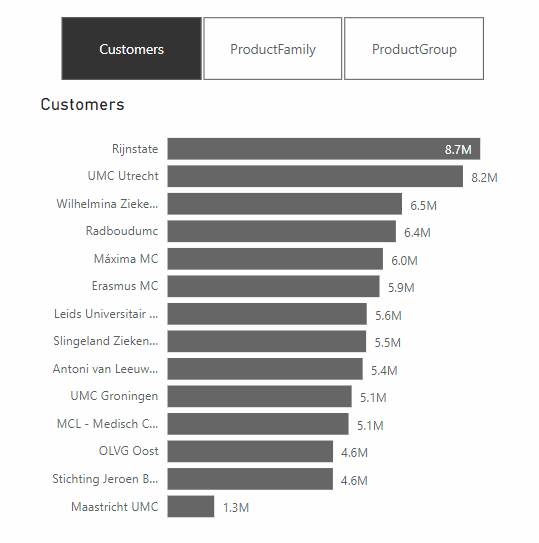
Let’s see what happens when we turn off the shared axis.
As you can see, it is not very easy to tell which product group is the largest if the y-axes are not equal. In fact, at first glance, it all looks the same. Only when you look longer do you see that the axes are not equal.
We believe that you should always keep the axes equal, and so even if they are small values. After all, you are comparing different segments. But then how can you visualize small multiples, while also making it easy to read? It’s simpler than it sounds, take a look:

In this case, we recommend using Zebra BI, a plug-in for BI tools such as Power BI. By using this plug-in, the small multiples are placed in boxes of different sizes depending on the values. This allows users to properly compare the segments and thus draw the correct conclusion, as they are not misled by different axes. Sounds useful right?
An update that simplifies reading a report
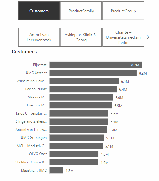
A feature from the same update that does make Power BI dashboards more effective, is the addition of Dynamic Slicers. With Dynamic Slicers, you can use field parameters to dynamically change the measurements or dimensions analyzed within a report. But why is this so useful?
With Dynamic Slicers, you can help readers of a BI report explore and customize the report, so they can use the information that is useful for their analysis. As shown in the GIF above, a user can filter by Customers, Product Family, Product Group, or other slicers that you’ve set up in the report.
In addition, you can parameterize slicers further to support dynamic filtering scenarios. In the GIF below, you can see how it works. You can see that the value comes from the dynamic slicer and changes dynamically. This gives your users even more opportunities to interact with the dashboard.
How do we make sure Dashboards are not misleading?
Of course, Microsoft continuously tries to update and improve Power BI, but some updates can have unwanted effects. We have been using IBCS standards for years as our Power BI report guidelines, and we also believe that if these standards are applied properly, you’ll prevent unintended consequences. To test if our reports comply with these standards, we use ZebraBI‘s IBCS-proof plug-in while building dashboards in PowerBI. Want to learn more about how IBCS standards can help your organization?
Learn more about IBCS reporting
Fill out this form below and find out the basics of IBCS reporting in a quick 20-minute webinar!