Mastering DAX
Keeping your skills up to date is crucial when you work with the newest technology. At Rockfeather, we challenge each other to be the best version of yourself. That’s why I attended the mastering DAX course. DAX (Data Analysis Expressions) is a formula expression language. Next to Power BI, DAX is applied in Excel Power Pivot and tabular models in SQL Server. Learn it once, use it always.
King of Data Analysis Expressions
After attending the Data modeling course of SQLBI in the fall, I was excited to participate in the mastering course. Three-days full of learning about the query language. Throughout the three days, Marco Russo told a lot of best practices. Marco runs SQLBI with his co-founder Alberto Ferrari. Together, they wrote several books about Microsoft Business Intelligence software.
Performance development
When you develop your reports and dashboard, you will learn that the xVelocity engine in Power BI works well with a lot of rows, even faster when there are a lot of columns with a lot of repeating values. The list of distinct values is shorter and more comfortable with compressing in Power BI.
On the last day of the course, Marco demonstrated the performance function in Power BI, called the Performance Analyzer. This function has been there since the Power BI Desktop release of May 2019 and records all the proceedings on the dashboard. After that, the solution shows you a report of all the performance data. This report illustrates the duration in milliseconds of every visual in your report. Use the Refresh visual button for comparing performance between sessions or reports, because capturing the initial load can be misleading. The initial amount executes different necessary procedures. This report shows you where you can improve your dashboard and make more impact with it.
Efficiency by DAX
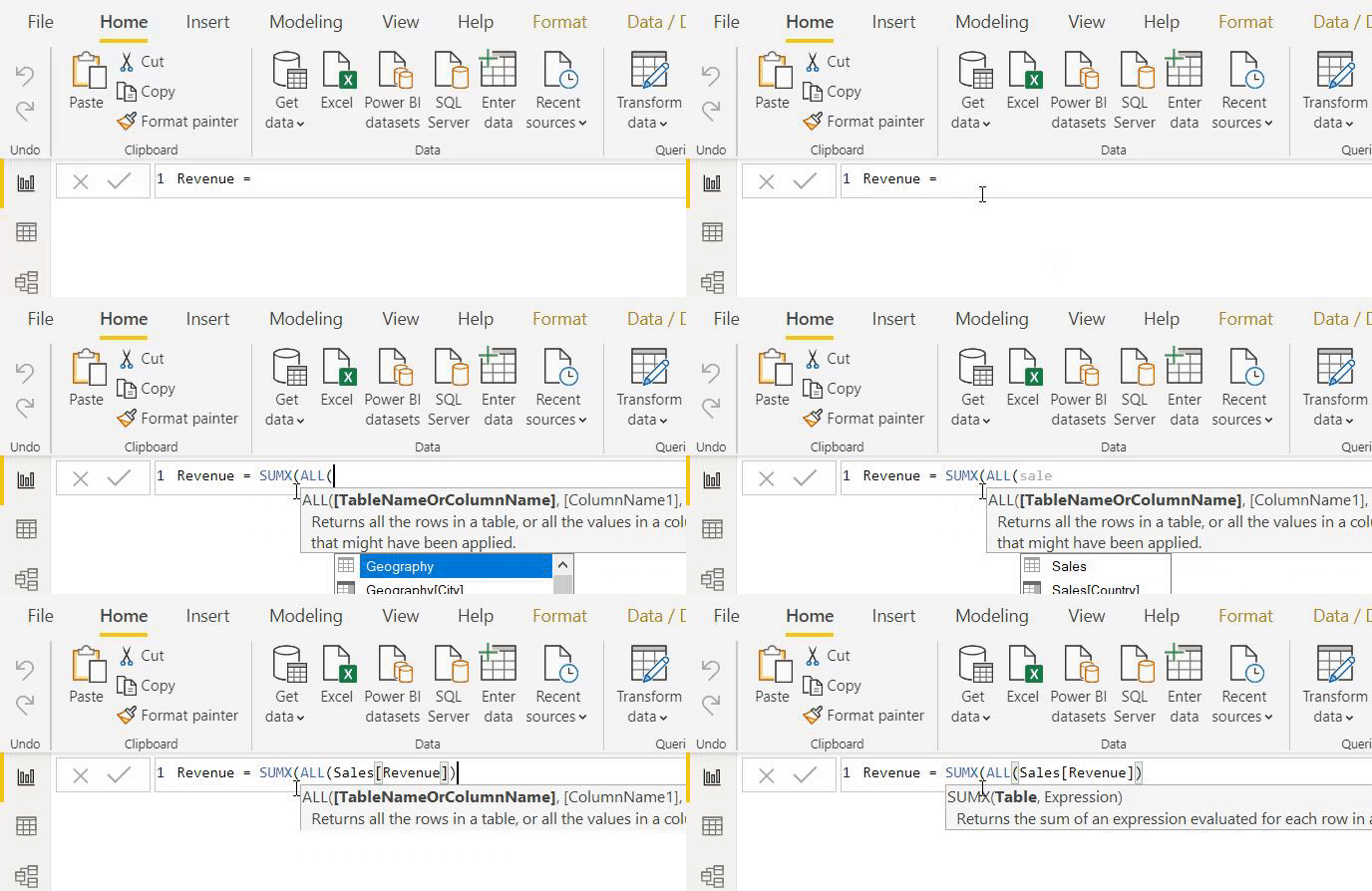
Another significant performance upgrade is the replacement of a table definition for a column in aggregated or filter functions. Because of this, DAX doesn’t have to load an entire table for a DAX-query, just a few columns will do the trick. Working with a few columns instead of a whole chart saves a lot of time in loading your report.

Sum it Up
To sum up: I’ve learned a lot during my time at the mastering DAX Course. Next to a lot of time-saving upgrades, I feel like the solution is getting more user-friendly and smarter every time I come back at DAX.

Artificial Intelligence is ready!
In this interview, Jonathan Aardema talks with Prof. Eric Postma (professor of Cognitive Science and Artificial Intelligence at the University of Tilburg) about the why, how, and what of artificial intelligence applications. What do we see in practice, and what does science say about it?

Visiting London for the Tableau Partner Executive Kick-Off 2020
Every year Tableau invites its most valuable partners to kick off the new year together. The theme for this year was Accelerate, so let’s get right to the point. This exciting event was focused on three main areas.

Mastering DAX
Keeping your skills up to date is crucial when you work with the newest technology. At Rockfeather, we challenge each other to be the best version of yourself. That’s why I attended the mastering DAX course. DAX (Data Analysis Expressions) is a formula expression language. Next to Power BI, DAX is applied in Excel Power Pivot and tabular models in SQL Server. Learn it once, use it tomorrow.