
Harvest data from your entire business
As a professional you know that the worlds of Finance and IT are moving closer and closer to each other. Your organization is looking for a way to harvest vast amounts of data within their domain and use it to its advantage.
Our customers want to implement a data-driven mindset within their company. They’re achieving this by a broader consumption of data and combining several data sources in one reporting platform.
A proper integration makes it possible for you to analyze and gain much more insights:
- Project members are able to see their own real-time financials and project data in one report.
- Store managers can see their KPI’s and compare these with the KPI’s of their peers to make improvements.
- Companies get a concise overview of the entire corporates’ performance with the ability to zoom in and out on details.
And so on! In this article, we will discuss all the possibilities for companies using CCH Tagetik or PowerBI and analyze this combination.
The current status quo for some
As companies have been using their CPM platforms for a while now, rich data has been created and collected there. Most of our clients have been reporting from their CCH Tagetik environments for several years now. Within this environment their financial statements can be viewed from intersections between dimensions such as: Companies, Costcenters, Lines of Business, Products, and Projects. But getting to share this knowledge with the people steering the business is not always optimally configured. In order to consume this data on a lower level within the business, experience and investment into the inner workings of the platform is required.
On the other hand, there is the PowerBI environment where easy to use dashboards can be defined and analyzed. But getting the data into PowerBI can be a challenge. A proper connection would, for example, not only bring in the financial data, but also the reporting structures. So the administration is centered into the platform where most of the business logics are. The ability to create your own reports is not without risks, however. Improper use of visualizations can lead to misinterpretations, which should be avoided. Just ask two analysts to create a visual out of some data, and most often you will receive two different visualizations.
Different Methods
There are methods however to prevent that. Just think about it, if a composer from Argentina creates a masterpiece, a musician from China is able to play it. Why shouldn’t you use a standard for visualisation within your own company? The good news is that there already is a standard for it: the International Business Communication Standards, better known as IBCS. And wouldn’t it be nice if the consumption of your reports would automatically follow these standards? While ideal, some companies are not yet able to correctly disclose their vast collection of data in such a way.
Getting to where you want
In order to get to the situation described in the opening of this article, two essential pieces of the puzzle must be found. Firstly, you need expertise in CCH Tagetik to disclose the proper data and expertise in PowerBI to not only successfully visualize. But also adhere to the standards, so you can significantly improve the efficiency of your analysis and the accuracy of your decisionmaking[1]. Now you can invest into these two roles separately, but you can also buy it off the shelf.
Over at Finext, we invested into these two pieces already and came up with our official CCH Tagetik to PowerBI connector. An off-the-shelf product that you can install in your CCH Tagetik and PowerBI environment to periodically send all required data from your system of record to your dashboarding platform. And with the use of the ZebraBI plug-in in addition to our connector you can make sure that all reports follow the IBCS methods, increasing the accuracy and efficiency of data consumption within your departments too. The standardisation of the product makes it easily implementable: within a few days you can roll out to your end-users. You probably spend more time deciding on whether to do it than to actually do it.
The benefits
So in short, connecting your company with its data allows you to get the following:
- Centralizing your end-users in PowerBI allows them to consume data in their own way, following business standards, which also has a more financially friendly license model than most EPM platforms
- The finance department becomes a real sparring partner for the business, allowing to support a much broader audience with their vast amounts of data
- A severe reduction in reliance on spreadsheets gives your data consumers much more overview, flexibility and ability to deep-dive than massive reporting packs
Want to learn more?
We tell our story in a series of videos. In these three videos we look at the proposition from three angles:
- A broad overview of the product, pricing and use cases for Executive Professionals
- An in-depth view of the product for Financial Professionals using CCH Tagetik
- An in-depth view of the product for Dashboarding Professionals using PowerBI
Choose whichever angle suits you best and come explore the endless possibilities with us. If you want to skip ahead of the queue and want to talk directly to us about it, let us know by leaving your contact details in the box below.
[1] Research by the University of Munich has shown that the efficiency of analysis improves by +46% and the accuracy of decisionmaking improves by +61% when using the standards of IBCS in your reporting.
Thank you!
We will contact you soon!

Artificial Intelligence is ready!
In this interview, Jonathan Aardema talks with Prof. Eric Postma (professor of Cognitive Science and Artificial Intelligence at the University of Tilburg) about the why, how, and what of artificial intelligence applications. What do we see in practice, and what does science say about it?

Visiting London for the Tableau Partner Executive Kick-Off 2020
Every year Tableau invites its most valuable partners to kick off the new year together. The theme for this year was Accelerate, so let’s get right to the point. This exciting event was focused on three main areas.

Mastering DAX
Keeping your skills up to date is crucial when you work with the newest technology. At Rockfeather, we challenge each other to be the best version of yourself. That’s why I attended the mastering DAX course. DAX (Data Analysis Expressions) is a formula expression language. Next to Power BI, DAX is applied in Excel Power Pivot and tabular models in SQL Server. Learn it once, use it tomorrow.

Stop customer churn with data science
There is one thing that’s just as important as finding new clients: keeping your current clients. This one-pager will give you some practical tips to increase your customer loyalty by making use of the science of data!
Want to get started with Data Science? Press the button below:
First things first
Firstly, you need to get insights into your existing customers:
- What are the characteristics of your loyal customers, and maybe more important;
- What are the characteristics of the customers that will probably leave your organization?
Lots of companies are focusing on getting new customers instead of keeping their existing customer base. For example, why are gyms and telecom providers giving a discount to their new customers, and not to their current customers? Due to these strategies, a lot of customers are hopping from company to company, which will not lead to a loyal customer base.
Recognizing churners’ behavior
This one-pager will go into the practical way of creating insights into the customers who have the highest probability of leaving your organization. These customers are going to churn, so from now on, they will be called churners.
Getting a list of your future churners is incredibly valuable to your business. You could give them a little bit extra TLC (tender, love & care) or a discount, depending on which marketing strategy is the best fit for each churner, to make sure that these churners will not leave.
You will need to do some study so you can determine which characteristics are most important for customers to become a churner. This one-pager will keep it clean and simple, to give you the information you need to start your analytical churn journey right away!
To define which characteristics of customers are good predictors for customer churn, you have to take a look at your historical data. This dataset must contain data from customers that have left your company in the past, and from customers that remained a customer. In this dataset, you will try to discover (hidden) patterns in the customers’ behavior that separate the churners from the not-churners. For example, you might find out that almost all the churners filed a complaint in the last six months of being a customer. This might indicate that the follow-up of the claims is not sufficient. Improving the follow-up could lead to fewer churners.
Stop Churn with Machine learning
Once your dataset is clean and complete, the real science of data begins. Machine learning models will help you find the (hidden) patterns within your dataset that separate the churners from not-churners. Once a model can discover these patterns in your historical dataset, it can predict whether your existing customers are going to churn or not. If existing customers have the same characteristics/behavior as the clients that did churn in the past, you could start alerting the marketing department and account managers to take action!
Conclusion
Preventing churn can be valuable for your organization. Knowing which customers are likely to churn not only brings in extra money, it can change your business model. If you reward your loyal customers regularly, you do not need to spend a fortune on finding new customers.
Curious how we could help you prevent your customers from churning? Or are you curious how data science could help your organization with other business problems? View some more information on a free data science discovery session.
Webinar Predict Churn with Artificial Intelligence:
Do you want to know how predictive models can help your company make better decisions? Watch our recording webinar “Predict churn with artificial intelligence“!

FREE: Data Science Discovery Session
Are you curious about how data science can help your organization? During this free discovery session, we will take a look at your business' most potential use cases.
Thank you!
Artificial Intelligence is ready!
In this interview, Jonathan Aardema talks with Prof. Eric Postma (professor of Cognitive Science and Artificial Intelligence at the University of Tilburg) about the why, how, and what of artificial intelligence applications. What do we see in practice, and what does science say about it?
Visiting London for the Tableau Partner Executive Kick-Off 2020
Every year Tableau invites its most valuable partners to kick off the new year together. The theme for this year was Accelerate, so let’s get right to the point. This exciting event was focused on three main areas.
Mastering DAX
Keeping your skills up to date is crucial when you work with the newest technology. At Rockfeather, we challenge each other to be the best version of yourself. That’s why I attended the mastering DAX course. DAX (Data Analysis Expressions) is a formula expression language. Next to Power BI, DAX is applied in Excel Power Pivot and tabular models in SQL Server. Learn it once, use it tomorrow.

Data Science Discovery Session
Data Science, Artificial Intelligence, and Machine Learning are becoming buzzwords more and more. The terms appear to be valuable according to the trendwatchers, but most often people do not even know what the terms mean, let alone that they use them.
We at Rockfeather help people and organizations to understand and retrieve value from the buzzwords.
Data Science Discovery Session
During this session, Rockfeather will help you find the most valuable Data Science use cases for your organization. Rockfeather uses a Data Science Framework to devise relevant use cases.
When you sign up for the discovery session, you will receive an online survey in your mailbox. The results of the survey will help us indicate in which stage your organization is regarding data science.
Together we will have a look at the results of the survey. Once the stage is determined, we will discuss the next steps and relevant data science use cases for your organization. After the session, you have a clear understanding of the stage your organization is currently in, what the next steps are, and what are relevant data science use cases to start with.
Interested in this free discovery session? Fill in the form below!
Request your discovery session below:
Fill in your contact information below, so that we can send you the survey to start your data science journey!
Thank you for your request!
We will get in touch with you as soon as possible.
Kind regards, Rockfeather
Artificial Intelligence is ready!
In this interview, Jonathan Aardema talks with Prof. Eric Postma (professor of Cognitive Science and Artificial Intelligence at the University of Tilburg) about the why, how, and what of artificial intelligence applications. What do we see in practice, and what does science say about it?
Visiting London for the Tableau Partner Executive Kick-Off 2020
Every year Tableau invites its most valuable partners to kick off the new year together. The theme for this year was Accelerate, so let’s get right to the point. This exciting event was focused on three main areas.
Mastering DAX
Keeping your skills up to date is crucial when you work with the newest technology. At Rockfeather, we challenge each other to be the best version of yourself. That’s why I attended the mastering DAX course. DAX (Data Analysis Expressions) is a formula expression language. Next to Power BI, DAX is applied in Excel Power Pivot and tabular models in SQL Server. Learn it once, use it tomorrow.

Data Science Survey Results
In collaboration with Finext and The Hague University of Applied Sciences, Rockfeather conducted a survey among our customers and other data enthusiast. The survey consists of twenty questions that investigate the data maturity, the presence of a data-mindset, and how they reach and plan to reach their data ambitions and goals.
Curious how data science can help your organization? Press the button below:
Key take-aways Data Science Survey
- Most companies currently are in the analytical aspiration stage but have the aspiration to improve their data maturity;
- Python is the most popular data science programming language;
- Microsoft Power BI and SQL are the most common data visualization and- integration tools;
- Improving data quality is seen as the biggest challenge for implementing a data-driven way of working.
Data maturity and ambitions
Data maturity
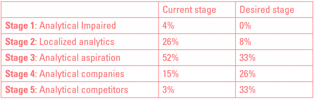
The framework as described in: “Competing on Analytics” by Thomas H. Davenport and Jeanne G Harris is used to determine the data maturity of the different companies. This framework distinguishes 5 stages of data maturity:
Stage 1: Analytical Impaired
“Organization has some data and management interest in analytics. “Stage 2: Localized analytics
“Functional management builds analytics momentum and executives’ interest through application of basic analytics”Stage 3: Analytical aspiration
“Executive commit to analytics by aligning resources and setting a timetable to build a broad analytical capability”Stage 4: Analytical companies
“Enterprise-wide analytics capability under development; top executives view analytic capability as a corporate priority”Stage 5: Analytical competitors
“Organization routinely reaping benefits of its enterprise-wide analytics capability and focusing on continuous analytics renewal”Our survey investigates in which stage companies are, based on seven different aspects that are shown in the image below. Click here or on the image to view the full image.

The results show that most companies are in stage 3, but 95% have the ambition to move to the next level or stay at the current stage.
One of the survey’s goals is to investigate how companies in different stages perform in the seven different aspects that determine the data maturity stage. Companies in stages 1-3 are compared with companies in stages 4 & 5. The results showed that companies who want to move past the third stage should improve in all aspects. This is in line with the general idea that if a company wants data science to be a competitive advantage source, they should embrace it in the whole company. Although it is important to improve all aspects, a few need some extra attention: Data, Analytical techniques, and the Enterprise.
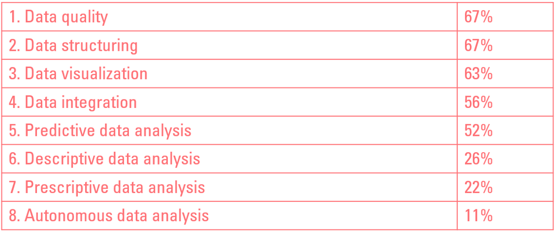
Data investments
To better understand how companies plan to reach the next stage, the survey questioned them about their planned investments in the upcoming year and in three years. The outcome shows that in the upcoming year, companies heavenly invest in data structure and data structuring. This is a logical first step since this is the foundation for further data analysis.
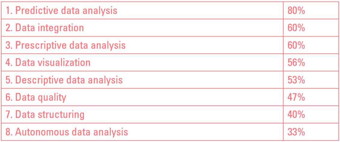
When analyzing the investment in the three-year horizon, it is clear that the investments shift from data quality and -structure to predictive data analysis, data integration, and prescriptive data analysis.
Data Tools
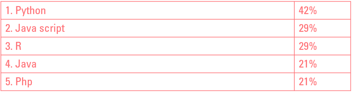
Data science programming languages
When it comes to data science programming languages, Python is on top; it is used by 42% of the companies. This is definitely in line with the industry and Rockfeather’s customers. Want to know more about data science in general and how it can help your company, visit our data science web page. The top 5 most popular data science programming languages are:
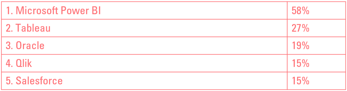
Data visualization tools
There is a clear winner concerning data visualization tools, and it is Microsoft Power BI, with Tableau and Oracle on appropriate distance. This is in line with the trends we see in this field and the yearly research conducted by Gartner. This research shows that Power BI has strengthened its leading position in completeness vision and ability to execute. Want to know more about the magic quadrant for Business intelligence tools? Read Rockfeather’s blog and watch the webinar on the Gartner Magic Quadrant for Analytics and Business Intelligence Platforms 2020! The top 5 most popular data visualization tools are:
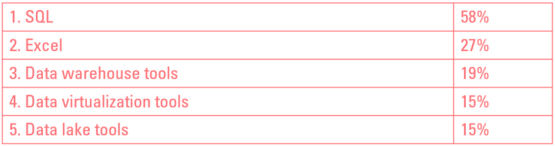
Data integration
In terms of data integration, SQL and Excel are still miles ahead of data warehouse-, data virtualization, and data lake tools. Data integration combines data from different sources and includes data cleaning, and ETL (Extract, Transform, Load) involves the ETL process. It is crucial for further data visualization and data science processes. The top 5 most popular ways to perform data integration are:
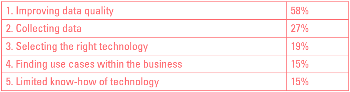
Challenges
Data science is more likely to reach its full potential if it is adopted in the whole company. This requires a data-driven way of working, which of course, comes with challenges. The biggest challenge is to improve the data quality; this is crucial for the success of any data-related project. The top 5 biggest challenges in implementing a data-driven way of working are:
Last but not least
Rockfeather donates 5 euro for every unique respondent towards the United Nations World Food Program so that they can help the people who need it the most.
Data Science Discovery Session
Curious how data science could help your organization? Fill in the contact form below for a free data science discovery session. Click here for more info.
FREE: Data Science Discovery Session
Are you curious about how data science can help your organization? During this free discovery session, we will take a look at your business' most potential use cases.
Artificial Intelligence is ready!
In this interview, Jonathan Aardema talks with Prof. Eric Postma (professor of Cognitive Science and Artificial Intelligence at the University of Tilburg) about the why, how, and what of artificial intelligence applications. What do we see in practice, and what does science say about it?
Visiting London for the Tableau Partner Executive Kick-Off 2020
Every year Tableau invites its most valuable partners to kick off the new year together. The theme for this year was Accelerate, so let’s get right to the point. This exciting event was focused on three main areas.
Mastering DAX
Keeping your skills up to date is crucial when you work with the newest technology. At Rockfeather, we challenge each other to be the best version of yourself. That’s why I attended the mastering DAX course. DAX (Data Analysis Expressions) is a formula expression language. Next to Power BI, DAX is applied in Excel Power Pivot and tabular models in SQL Server. Learn it once, use it tomorrow.

How process optimization helps you move to the next level?
What is the optimal set of processes to allocate our resources? What process and steps do we have? These questions seem like questions that every company should answer easily. Unfortunately, a lot of companies are not able to do so. Their processes are just too complex because of changing price constraints, or other variables. There is a solution: Process optimization.
What is process optimization?
In theory, the concept of process optimization is relatively simple. A process is optimized based on a certain measurement and given a set of constraints and variables. Examples of measurements are profit, production, and costs which are maximized or minimized. Typical constraints are production capacity, demand- and supply of goods. Prices and costs are examples of variables that change and have an effect on the outcome. A process that can be optimized is characterized by different process steps where a choice can be made. Eventually, this choice affects the total outcome.
The process
Generally, a process has a large set of constraints. It’s a list of variables that change over time and a set of different inputs that make use of the same capacity in different locations. As a result, the optimal allocation also differs over time and is rarely easily calculated. This is where process optimization comes in handy. A linear optimization model calculates the optimal allocation of resources.
Flexibility
This model is flexible and calculates a new optimal allocation if one of the variables or constraints changes. Because of this flexibility, a business user can answer questions such as: What are the optimal allocations of different products? What is the effect of a change in the price, demand, or supply? Faster and based on (new) data instead of based on gut feeling. See the example below.
Relevant industries/companies
Overall, process optimization is relevant for all companies where their (production) process is characterized by the characteristics from above. Process optimization is, for instance, relevant for an operational manager of a production company with a hundred different products that are produced in different locations. And sell to a different buyer for market prices who want to optimize its profit. But also for a smaller company that is looking for the optimal machine setting to minimize the costs.
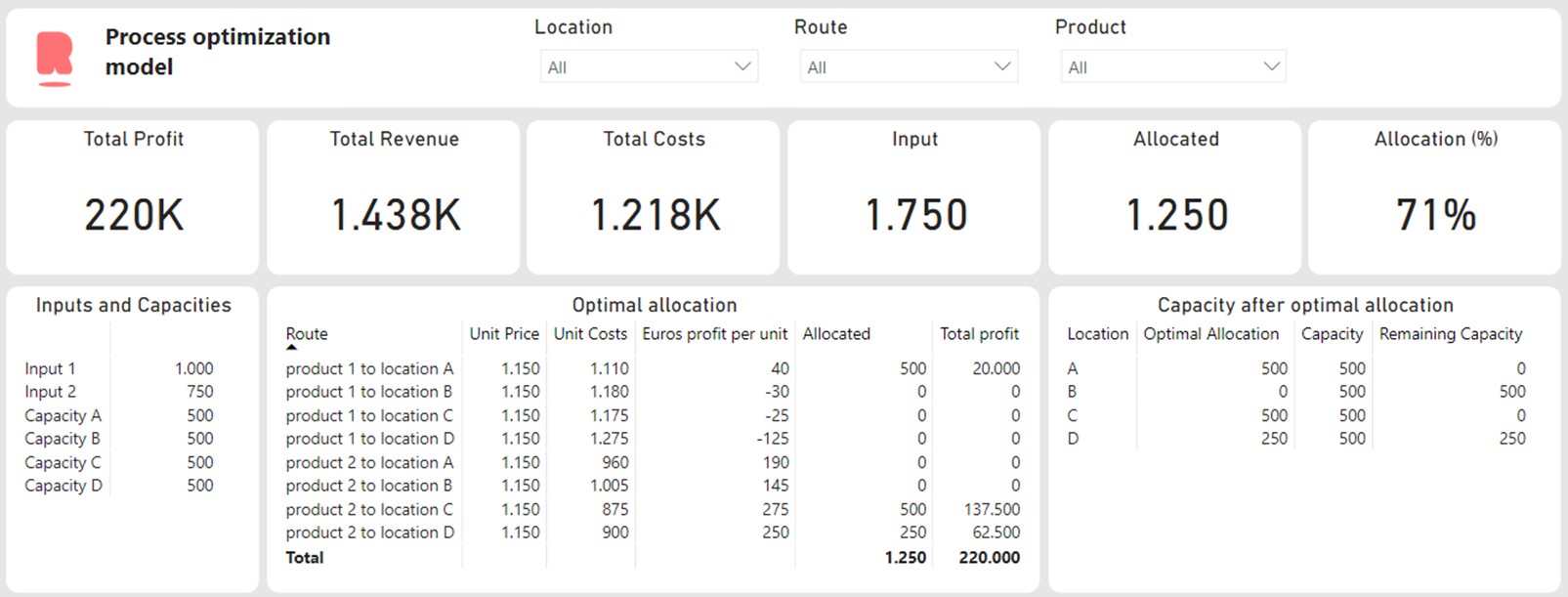
Process optimization example
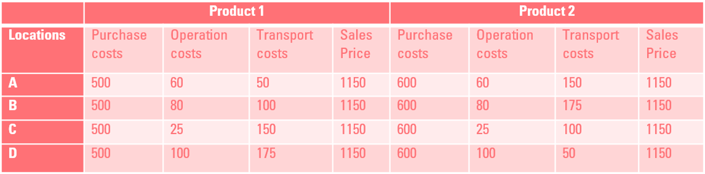
In this example, we as data scientist got a question from an operational director to optimize the production process. In this case, product 1 (Quantity = 1000) & product 2 (Quantity = 750) takes place in four locations; each location has a capacity of 500 units. Other variables such as the costs and the prices depend on the product and the location of production, see table below:
Combination Power BI and Python
Particularly, this linear optimization task is performed with the Scipy library in Python. The outcomes are visualized in Power BI. The Python code runs in the background. This Power BI dashboard provides an overview of the optimal allocation, the results can also be incorporated in other dashboards and/or reports. Power BI provides the opportunity to share the outcomes with colleagues.
Example Python Code
For example, in this dashboard, the Python code is integrated into the Power BI dashboard. This gives us the ability to include Power BI parameters in the Python code, which we can modify. A big advantage is that the model is flexible, and a user can test some scenarios or change variables if needed without adjusting the Python code. Let’s say we want to know what a sales price increase of 50 euros in location B for product 1 will do to our profit and production. Then we can easily do so by changing the parameters. See gif below:
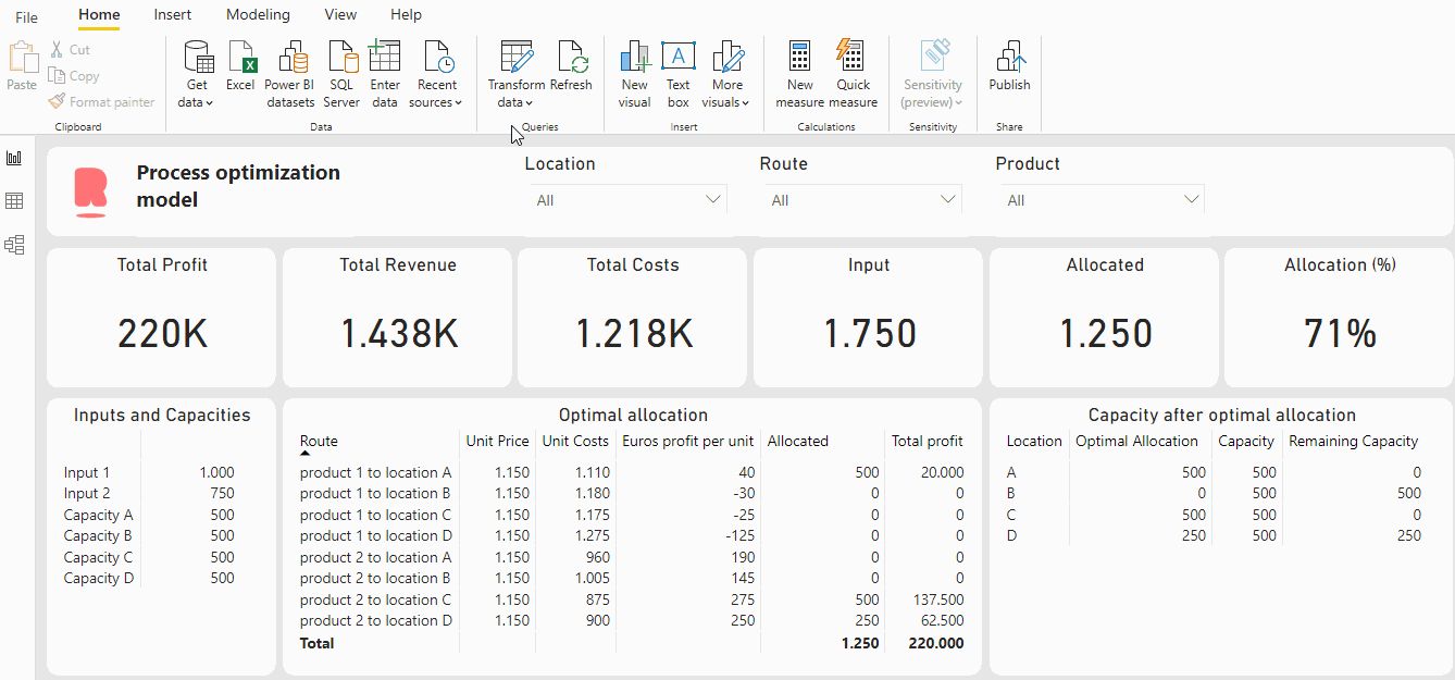
As a result of this price increase, the profit increased from 220K to 230K and all inputs are allocated. This is a quite simple example, but this can of course be extended. The possibilities are limitless!
The method used above is Linear programming or linear optimization. This is a subfield of mathematical optimization and the most common to solve process optimization problems. Linear programming is a technique to find the optimal outcome for a model where the relationship between the function and the constraint is linear.
Conclusion
In conclusion, a process optimization model helps a lot of companies to optimize their (production) process. In this blog, you learn about the possibilities of Python integrated into Power BI. Overall, a big advantage is that the end-user doesn’t need to code anything. While they can simply modify parameters and the python code will run in the background and calculate the new optimal allocation of the resources given the new variables.
Curious how process optimization can help you optimize your processes? Or are you curious how data science could help your organization with other business problems? Fill in the contact form below for a free data science discovery session!
FREE: Data Science Discovery Session
Are you curious about how process optimization can help you optimize your processes? Or how other business problems can be tackled by making use of data science? During this free discovery session, we will take a look at your business' most potential use cases.
Artificial Intelligence is ready!
In this interview, Jonathan Aardema talks with Prof. Eric Postma (professor of Cognitive Science and Artificial Intelligence at the University of Tilburg) about the why, how, and what of artificial intelligence applications. What do we see in practice, and what does science say about it?
Visiting London for the Tableau Partner Executive Kick-Off 2020
Every year Tableau invites its most valuable partners to kick off the new year together. The theme for this year was Accelerate, so let’s get right to the point. This exciting event was focused on three main areas.
Mastering DAX
Keeping your skills up to date is crucial when you work with the newest technology. At Rockfeather, we challenge each other to be the best version of yourself. That’s why I attended the mastering DAX course. DAX (Data Analysis Expressions) is a formula expression language. Next to Power BI, DAX is applied in Excel Power Pivot and tabular models in SQL Server. Learn it once, use it tomorrow.

Gartner's Magic Quadrant for Data Science and Machine Learning Platforms 2021
This year’s Magic Quadrant for Data Science and Machine Learning Platforms scored six Data Science and Machine Learning (DSML) Platforms as leaders. The amount of leaders has remained the same, compared to last year’s number of leaders. But has the composition of the leading area changed?
Six leading DSML Platforms in Gartners’ 2021 MQ
This year’s Magic Quadrant scored six Data Science and Machine Learning (DSML) Platforms as leaders. The amount of leaders has remained the same, compared to last year’s number of leaders. But has the composition of the leading area changed?
What is the Magic Quadrant (MQ) for Data Science and Machine Learning?
Are you looking for a Data Science and Machine Learning solution? Then Gartner’s Magic Quadrant is a valuable resource. A lot of people only look at the famous 2-by-2-matrix, but there is much more than just this matrix. That’s why we dug into the dirty details of the full report and put all this into a 20-minute webinar. In this webinar, you will learn about the vendors that are scored as a leader in Gartner’s 2021 MQ.
Is the Magic Quadrant for you?
A magic quadrant for data science is interesting but who are the main users of these toolsets? Data Scientist is a relatively new profession. We typically see two sorts of data scientists. The first one is the data analyst/business controller who does not have a lot of code or programming skills but still wants to create an accurate prediction to help decision making. This group is also known as the Citizen Data Scientists. The other group is the one including all the expert/hardcore data scientists, who love to use code to get the best possible prediction for their use case. For both groups the magic quadrant is a valuable resource; the quadrant includes toolsets for both types of data scientists.
What will you learn?
We start the webinar with an explanation of the Magic Quadrant for Data Science and Machine Learning (DSML) Platforms. After that, we will show the MQ with all the scored vendors. Once we showed all the vendors, we will take a deep dive into the details of the leading vendors. The strengths and cautions of the leading vendors will be discussed, besides the vendor’s development over the last three years.
New vendors in the Magic Quadrant
This year’s MQ has 20 vendors in it, four more than last year. The new vendors scored in the MQ are:
- Alibaba Cloud
- Amazon Web Services
- Cloudera
- Samsung SDS
Did one of them already reach the leader’s quadrant?
Watch the webinar
Are you looking for a DSML solution, whether you are a citizen or a hardcore data scientist? This webinar gives you insight into which of the leading vendors will be the best fit for you. Watch the webinar below to learn more about the key findings of the magic quadrant.
Watch the webinar here!
Gartner’s Magic Quadrant for Data Science and Machine Learning Platforms
Artificial Intelligence is ready!
In this interview, Jonathan Aardema talks with Prof. Eric Postma (professor of Cognitive Science and Artificial Intelligence at the University of Tilburg) about the why, how, and what of artificial intelligence applications. What do we see in practice, and what does science say about it?
Visiting London for the Tableau Partner Executive Kick-Off 2020
Every year Tableau invites its most valuable partners to kick off the new year together. The theme for this year was Accelerate, so let’s get right to the point. This exciting event was focused on three main areas.
Mastering DAX
Keeping your skills up to date is crucial when you work with the newest technology. At Rockfeather, we challenge each other to be the best version of yourself. That’s why I attended the mastering DAX course. DAX (Data Analysis Expressions) is a formula expression language. Next to Power BI, DAX is applied in Excel Power Pivot and tabular models in SQL Server. Learn it once, use it tomorrow.

Gartner Magic Quadrant for Analytics and Business Intelligence Platforms 2021
For years, Gartner’s Magic Quadrant for Analytics and Business Intelligence has been the leading report in the world of data visualization. However, many people only look at the 2x2 matrix without going into the details of the report. Although we understand why you would not have the time to go through almost 40 pages of content, you are missing out on some valuable information. Not only does the in-depth report discuss the strengths and weaknesses of the top 20 vendors, it also contains trends and shifts in the market. That is why we will briefly discuss the most important findings of this year’s magic quadrant for analytics and business intelligence platforms in this 30-minute webinar.
Power BI and Tableau, closing the gap?
In the last couple of editions, there were two clear leaders: Power BI and Tableau. Microsoft’s integration with Office 365 and attractive pricing caused a shock in the market for analytics and business intelligence (ABI) platforms when it was first introduced. Microsoft has been investing a lot of time and effort into the integration with other Office applications such as Teams and into making Power BI an even better product. On the other hand, the acquisition of Tableau by tech-giant Salesforce in 2019 sent a strong signal to the market. The intuitiveness of Tableau combined with a large number of organizations using Salesforce opens up a variety of opportunities.
Qlik, what advantages does a broad portfolio bring?
However, an established name in the ABI market, Qlik, was also one of the leaders in the 2020 version of the magic quadrant. They have more than 25 years of experience in the industry with their unique Qlik Associative Engine. Qlik offers a broad number of products in their portfolio, which means it covers a lot of ABI needs. However, this complex portfolio also comes with a lack of product cohesiveness, which meant that Qlik has lost some momentum in recent years.
Looker, is Google betting on the right horse?
A newer players in the market for ABI is Looker. As this platform was acquired by Google in 2020, it has increased market recognition. Moreover, the possibilities of integration Looker into Google Cloud Platform makes it a one to watch. Google has also made efforts to improve the user experience and the integration with Google Sheets and Google BigQuery.
Watch the webinar
Is the gap between Tableau and Power BI versus the rest of the market getting bigger or did other vendors manage to close the gap? And how is the situation between Tableau and Power BI developing? Are they still close to each other or will there be a clearer difference between the two tools? Watch our webinar to learn more about the key findings of the magic quadrant. In 30 minutes, you will know the most important takeaways of this year’s report which will help you understand the market for analytics and business intelligence better.
Watch the webinar here!
Gartner Magic Quadrant for Analytics and Business Intelligence Platforms 2021
Artificial Intelligence is ready!
In this interview, Jonathan Aardema talks with Prof. Eric Postma (professor of Cognitive Science and Artificial Intelligence at the University of Tilburg) about the why, how, and what of artificial intelligence applications. What do we see in practice, and what does science say about it?
Visiting London for the Tableau Partner Executive Kick-Off 2020
Every year Tableau invites its most valuable partners to kick off the new year together. The theme for this year was Accelerate, so let’s get right to the point. This exciting event was focused on three main areas.
Mastering DAX
Keeping your skills up to date is crucial when you work with the newest technology. At Rockfeather, we challenge each other to be the best version of yourself. That’s why I attended the mastering DAX course. DAX (Data Analysis Expressions) is a formula expression language. Next to Power BI, DAX is applied in Excel Power Pivot and tabular models in SQL Server. Learn it once, use it tomorrow.

Power BI vs Tableau: Filter out the Noise
Power BI and Tableau are both leading data visualization solutions. Comparing the two options can be a daunting task. There is a lot of marketing noise from parties that sell or work with just one of the two solutions. This will not help you.
The Analyst View
Analysts typically limit themselves to high level tactical comparisons. Their job is to focus more on the long term and help you with more strategic decisions. That is valuable information of course. This is good to know, but not if you want to dig into the features of today’s solution.
Comparing the features
To help you to make better-informed decisions, our Tableau and Power BI experts developed a deep-dive webinar. In this webinar the experts compare the two solutions on five aspects. In 20 minutes, you will learn the difference between Tableau and Power BI focusing on Data Connection, Data Modelling, Data Visualization, Formulas and Platform. Watch the webinar right now by filling out the form.
Learn even more, get hands on
If you want to learn even more, you can join one of our test drives. In the Tableau or Power BI test drive you will get hands on experience with these solutions. You can sign up for these free online test drives below.
Tableau Test Drive
Power BI Test Drive
Watch the full webinar
Watch the webinar and in 20 minutes, you will learn the difference between Tableau and Power BI focusing on Data Connection, Data Modelling, Data Visualization, Formulas and Platform. Just fill out the form and you will get instant access. Besides, don't worry! We won't give your details to anybody else and we won't spam you with non-relevant info.
Power BI vs Tableau: Filter out the Noise
-
Power BI vs Tableau: Filter out the Noise

Related posts
Artificial Intelligence is ready!
In this interview, Jonathan Aardema talks with Prof. Eric Postma (professor of Cognitive Science and Artificial Intelligence at the University of Tilburg) about the why, how, and what of artificial intelligence applications. What do we see in practice, and what does science say about it?
Visiting London for the Tableau Partner Executive Kick-Off 2020
Every year Tableau invites its most valuable partners to kick off the new year together. The theme for this year was Accelerate, so let’s get right to the point. This exciting event was focused on three main areas.
Mastering DAX
Keeping your skills up to date is crucial when you work with the newest technology. At Rockfeather, we challenge each other to be the best version of yourself. That’s why I attended the mastering DAX course. DAX (Data Analysis Expressions) is a formula expression language. Next to Power BI, DAX is applied in Excel Power Pivot and tabular models in SQL Server. Learn it once, use it tomorrow.

Why data science isn't magic: an introduction to data science
Data science, artificial intelligence and machine learning are terms that you might have seen before. Companies big and small are jumping on the data science bandwagon. Although the incentive is there, the fundamental understanding often lacks. In this introduction to data science you will learn all about the basics and fundamentals. Get started!
The fundamentals: data
Data without context is gibberish, just as the word ‘red’ has no inherent meaning except for being a color. But in context, e.g. “the traffic light’s color is red”, you can use that information to anticipate your next actions. You can use the DIKW (Data Information Knowledge and Wisdom) pyramid to put data in context.
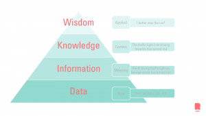
What is data science?
Since this blog is an introduction to data science, let’s start with the basics. With data science you use data and give meaning to the data. In other words, transform data to information. This transformation can be done by visualizing data, learning the processes in which the data is used, and/or understanding the metadata. The information will be transformed into knowledge when you provide the context. Once all the cards are on the table, we can plan for action: wisdom!
Wisdom is where we apply our knowledge to the best of our abilities. Data scientist usually report their findings with a recommendation to the management. The DIKW pyramid is the foundation of data transformation. Every data scientist or machine learning engineer goes through this process explicitly or implicitly.
Data science & data mining
Now that we know what cycle the data goes through, we can start looking at the good stuff: data mining. Data mining is a field in data science that is concerned with retrieving data and creating predictions. This definition is a nuance since it covers a wide area of things, but since this is an introduction to data science, we want to keep it simple in this blog. Also, these definitions are not set in stone and vary from time to time and from person to person. We use data mining techniques to predict what new data will do, based on old data. In other words, we train models with old data to predict what new data will do. We will be covering two techniques of data mining: supervised and unsupervised.
Supervised Learning
What is Supervised learning?
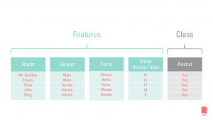
Supervised learning means we have both the characteristics and the answer to the question. Much like teaching a kid the difference between a dog and a cat, we teach the model in a similar fashion. The next figure shows the characteristics of a dog and a cat. The characteristics describing the animal are called ‘features’. These features describe an animal, namely a dog or a cat. The element that is described by the features, is called the ‘class’ or ‘target’ (variable). In almost any case, you structure the layout of the features with its class in a table. We refer to the total number of features as the dimensionality of the dataset. The more features you have, the more information you have for predicting the class. However, too many features can cloud the model, damning your dataset with the curse of dimensionality.
The model tells us its prediction based on the characteristics, and we can assess (supervise) whether the model has predicted the class correctly. If not, we will adjust the model and tell him which characteristics are important, and which are not. This way of working is the premise of supervised learning in a nutshell. If you are looking for a Data Science and Machine Learning solution, then Gartner’s Magic Quadrant is a valuable resource.
Unsupervised learning
What is Unsupervised learning?
Unsupervised learning means we do not have the answer to the question (i.e. we do not have a class variable), but we deduce the answer by comparing the characteristics. When we are at a social event, small groups will form. We can use the proximity (characteristic) of the people to see which group they belong to. We can then label the people with, say, colored t-shirts. The t-shirts represent the class variable. Once they all wear the t-shirts, and new characteristics arise, we are still able to tell who belongs to which group. That is the gist of unsupervised learning. There are more methods such as semi-supervised learning or reinforcement learning. Now that you’ve learned all about the basics and fundamentals in this introduction to data science, we want you to go down that rabbit hole on your own.
Related posts
Artificial Intelligence is ready!
In this interview, Jonathan Aardema talks with Prof. Eric Postma (professor of Cognitive Science and Artificial Intelligence at the University of Tilburg) about the why, how, and what of artificial intelligence applications. What do we see in practice, and what does science say about it?
Visiting London for the Tableau Partner Executive Kick-Off 2020
Every year Tableau invites its most valuable partners to kick off the new year together. The theme for this year was Accelerate, so let’s get right to the point. This exciting event was focused on three main areas.
Mastering DAX
Keeping your skills up to date is crucial when you work with the newest technology. At Rockfeather, we challenge each other to be the best version of yourself. That’s why I attended the mastering DAX course. DAX (Data Analysis Expressions) is a formula expression language. Next to Power BI, DAX is applied in Excel Power Pivot and tabular models in SQL Server. Learn it once, use it tomorrow.