Our Content
Welcome to our content section. We have content about everything on Data Visualization, Data Engineering, Data Science, Low Code, Technologies. You can find the subjects you are looking for by using the filter option below. Please contact us if you want to share your thoughts about our content.

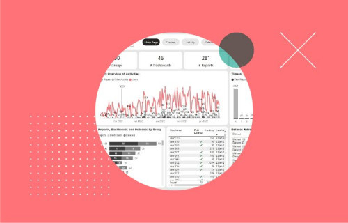
Become a better admin with the Power BI Admin Dashboard
The Power BI Admin Dashboard is a feature in Microsoft Power BI that gives the people overseeing Power BI users more information in an easy-to-read dashboard. Through the power of the Azure portal or Office 365 platform, the Power BI Admin dashboard has more features to take monitoring to the next level.

Online Workshop Power BI (dutch spoken)
In this online workshop, you will learn about several key features of the Power BI service. This introductory course is designed to teach you step-by-step how to create Power BI Desktop reports. Fill in your details to view this session!
Language workshop: Dutch.

Row-level security in Power BI
To ensure that data in Power BI reports do not fall into the wrong hands, it is possible to apply Row-Level Security (RLS) to any report within a workspace. RLS in Power BI ensures that for each recipient of the report a difference can be made in what data they can see. It is important that the setup is done accurately and that the members of a workspace are assigned the right role to prevent them from seeing too much information, for example. This RLS layout of the online workspaces in Power BI has changed in the last few months. In this blog, we explain what to pay attention to when setting up a new workspace and setting up the renewed RLS in Power BI.

Automated reports with Power BI Report Builder
The fact that Power BI can be used to create dashboards is by now known to many organisations. However, many people do not know that there is a tool within Power BI that can help when there is a specific demand for (automated) PDF or Excel reports. This tool is called Power BI Report Builder. In this article, we will take a closer look at Power BI Report Builder to give you a better understanding of this tool.

Integrate CCH Tagetik into PowerBI quickly and easily!
For years people have been saying that the worlds of Finance and IT are moving closer together. What does this mean for your company? What opportunities are there in terms of integration and visualization? How can you make it easy for yourself in a (seemingly) complex application landscape? In this video we look at how you, as a Power BI Professional, can achieve a seamless integration of CCH Tagetik data in a quick and easy way.

Harvest data from your entire business
As the worlds of Finance and IT are moving closer and closer, companies are looking to harvest the vast amounts of data within their domain and use it for their benefit. Our customers are looking to insert a data driven mindset within their company. On one hand that is achieved through a broader consumption of data within the company, but also to combine several data sources in one reporting platform.

Power BI vs Tableau: Filter out the Noise
Power BI and Tableau are both leading data visualization solutions. Comparing the two options can be a daunting task. There is a lot of marketing noise from parties that sell or work with just one of the two solutions. This will not help you.

Mastering DAX
Keeping your skills up to date is crucial when you work with the newest technology. At Rockfeather, we challenge each other to be the best version of yourself. That’s why I attended the mastering DAX course. DAX (Data Analysis Expressions) is a formula expression language. Next to Power BI, DAX is applied in Excel Power Pivot and tabular models in SQL Server. Learn it once, use it tomorrow.