
Predicting housing prices and sales using data science
Scheduling staff, purchasing more stock or predicting house prices of a specific neighborhood… These are all examples of what you can achieve using predictions. In this blog, we are going to use data science as a method to predict housing prices and sales. If you make proper use of predictions, it can set the standard for profits and growth. We will explain regression models by presenting two examples: housing prices and expected sales.
Regression
As explained in the blog using data science to decrease customer churn, classification is a powerful method of separating two (or more) entities based on their features. In our example of cats and dogs, we used features such as sleeping schedule and the sound they produce. But what if we want to predict a continuous value – say, height of a person, rather than a binary value? We could expand the classes that the model can choose from significantly, and we would still be in the realm of classification, i.e. multiclass classification problems. Bins could be created, with each bin containing a range of values. However, you could get an infinite amount of bins. As you can imagine, this is not efficient at all, both for time and space complexity.
The better option is regression. Borrowed and adapted from the statistics discipline, we will take a look at their examples. We will be considering linear regression, because it is the easiest and most straight forward method of regression. Note that logistic regression (explained in our customer churn blog) also is technically a regressor, but adapted for classification.
Example 1: predicting the house prices
Ok, enough theory, I will now bring some data to the table. If we want to predict the house prices of a specific neighborhood, we can have as many features as we want. More features mean larger vectors for the classifier. But be careful; too many features could potentially create a noise that clouds the classifier. For this example, we will be using only one feature: floor space in square meters. To link back to statistics, we consider the feature to be the independent variable, whereas the price of a house is the dependent variable. In other words, the house price is directly linked to the floor space. We assume that there is a linear relationship between these two variables.

The x-axis shows the features of the dataset. In this case, that would be the floor space, the independent variable. The price on the y-axis is the target we would like to predict. The figure shows the best fitting line for our model. This line should be read as follows; if we have a house in this neighborhood with an x amount of floor space (horizontal axis), the intersect on the line gives us the price of this house, shown on the y-axis (the vertical axis).
Sum of Squares
But how does the model know which line fits the data? There are many ways to calculate the best line, but we will stay true to the statistical nature of things. By now you may have noticed a little green square in the figure. This square is the distance of the data point A (on which we train) with the potential line for the model. This distance is squared, hence the little square, and summed with all the other data points in the figure. This process is repeated many times, with many different potential model lines. The smaller the summed value, the better the line fits. Note this is a very abstract explanation of the sum of squares method.
Limitations of one feature models
In larger models the x-axis is populated with more features (higher dimensional), to make the model perform even better. Many features cannot be shown as easily on figures as we have just described. Zero features (line), one feature (2D plot), and two features (3D plot) can be shown in models. Visualizing more dimensions are not feasible in conventional ways. One feature models are rarely the golden ticket but serve as a good example of explanations.
Example 2: predicting sales for an ice cream parlor
Let’s take a look at another example. We want to predict a numeric value, which is the number of sales from an ice cream parlor. We have data from an ice cream parlor in Rotterdam, which collected sales data over the last three years. This variable, ‘sales’, is our target variable. We want to train an algorithm to understand why the amount of sales differs over time.
Getting external data on board
The internal data from the ice cream parlor is about the number of sales and when the sales happened. If we want additional information, we need external data to enrich our dataset. In this case, it might be very interesting to add weather data. Although I like ice cream, I rather eat it on a sunny day than on a cold day when it’s raining cats and dogs. Another interesting external information source might be the school holidays calendar, as we expect more families to visit the ice cream shop during the holidays.
Once we think we have gathered enough data to make a reliable prediction, we combine the internal and external data sources so that we have a proper dataset that can be used to train our algorithm. So, for example, the linear regression model will generate a prediction for the next 12 days. The weather forecast for the next 12 days and the school holiday calendar for the next 12 days are input variables (independent) for the model, which will give a prediction for the ice cream parlor in terms of his expected sales. This can help him with scheduling staff and purchasing more stock.

Related posts

Artificial Intelligence is ready!
In this interview, Jonathan Aardema talks with Prof. Eric Postma (professor of Cognitive Science and Artificial Intelligence at the University of Tilburg) about the why, how, and what of artificial intelligence applications. What do we see in practice, and what does science say about it?

Visiting London for the Tableau Partner Executive Kick-Off 2020
Every year Tableau invites its most valuable partners to kick off the new year together. The theme for this year was Accelerate, so let’s get right to the point. This exciting event was focused on three main areas.

Mastering DAX
Keeping your skills up to date is crucial when you work with the newest technology. At Rockfeather, we challenge each other to be the best version of yourself. That’s why I attended the mastering DAX course. DAX (Data Analysis Expressions) is a formula expression language. Next to Power BI, DAX is applied in Excel Power Pivot and tabular models in SQL Server. Learn it once, use it tomorrow.

Using data science to decrease customer churn
Now that you have gained more information about the basics and fundamentals of data science, we are going to delve further into the transformation of this data. The information which results from this is all we need to decrease customer churn with data science. In this blog, we will explain classification models and present a churn use case of a football club.
Classification
In the blog Why data science isn’t magic, we already explained the importance of data. The data transforms into information the moment we know what the data refers to. To start decreasing customer churn using data science, this information is crucial. This information is what we use as features for our machine learning tasks. As you’ll recall from our previous blog, there are two important parts of a machine learning database: the features and the class. Let us dive into the class variable, which is the ‘Animal’ column in our example.
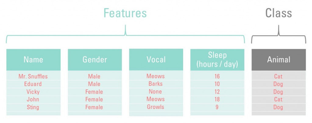
Binary classification
There are only two values for animals: ‘cat’ and ‘dog’. Let’s assume that this dataset only consists of cats and dogs. Our churn model, once trained, can only choose between these two values (labels). We call these binary classification problems. A binary classification problem can only have two values as a class variable. In this case ‘cat’ and ‘dog’. Any class with only two labels are called binary classification problems. If you want to know whether a customer made the purchase or not, you can signify that true or false. Later you can train the model on the characteristics (features) of these customers, resulting in you knowing why a sale did or did not take place. Pretty nifty, right?
Multiclass problems
You might be thinking right now: “so, if a class with two labels exists, what about a three-labeled class?”. A class with three labels does indeed exist, just like there is a class with four, five, or twenty labels. This is called a multiclass problem. The concept is entirely the same: the churn model can predict one of the n classes, instead of just two. What happens underneath the hood, however, is where the difference between the two types of problems arise.
The difference is in the algorithms
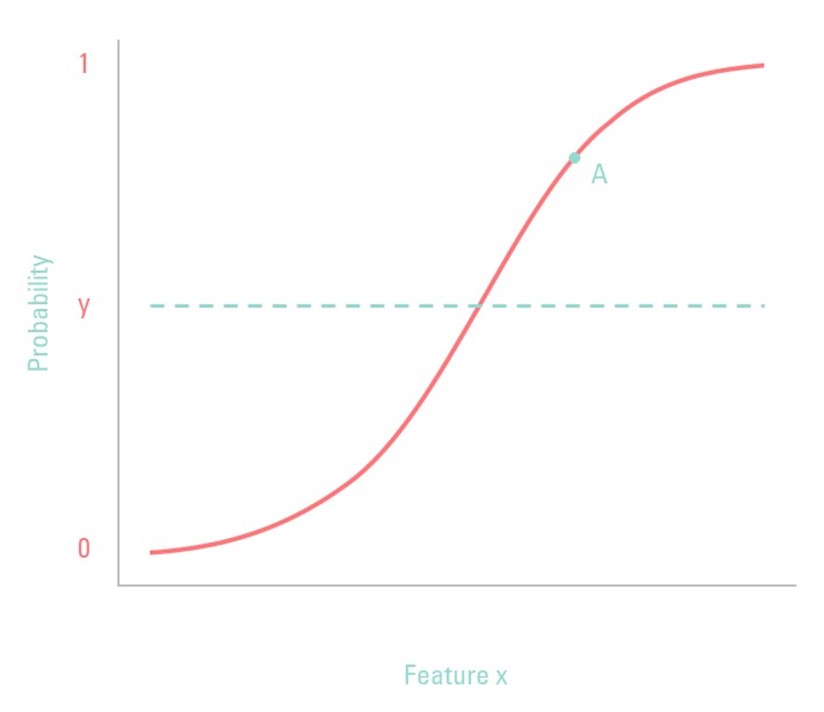
As stated before, binary classification problems have two labels; multiclass classification problems have more than two labels. The fundamental difference between the two is the algorithms that each one uses. Some algorithms are designed specifically for binary classification. Let us take logistic regression as our classifier, as this one is specifically designed for binary classification. The graph below shows the function used for logistic regression. Unlike linear regression, logistic regression only classifies between the 0 and 1, as is shown on the y-axis, whereas linear regression has a continuous value. This makes logistic regression perfect for binary classification problems.
The y-axis shows the probability for feature X. Note: the x-axis only shows one feature, but in reality, it can (and should) hold many variables for predicting the probability of the class. The line denoted by y is the threshold value: if the probability of feature X (the independent variable, for the statisticians) is above this value, the classifier will classify this element as the ‘True’ value.
An example of the model
Ok, that was quite a theoretical explanation. Allow me to demonstrate with an example. By now, you may have noticed the ‘A’ in the figure below. This point corresponds to feature X with a random value. This random value has a probability of 80% to be of class ‘True’ (in false vs. true) or ‘Overweight’ (in ‘not overweight’ vs. ‘overweight’). Or to put it differently, there is only a 20% chance that this variable corresponds to class ‘False’. In reality, logistic regression is more complex, but this illustrates the general idea.
Predicting customer churn: use-case at a football club
In this section, we will give an example of a classification case. Imagine Football Club A. Each season every football club sells season tickets to its fans. At the end of a season, Football Club A asks her fans if they want to renew their season ticket. Most fans will, but a small amount of these fans will churn, which means that they will not renew their membership. These churners will lead to a decrease in revenue, which Football Club A wants to prevent. If the football club could know which fans will churn, they could act on this by giving them extra attention and a discount. But how on earth could Football Club A know which fans will churn?
Features and target variable
Machine learning can help Football Club A by identifying these fans. Based on the seasons before, the FC knows which fans churned in the past. The FC has information about these fans, like how often they visited the matches and what the prices are for their season tickets. The football club can use this type of information as features in a machine learning algorithm. The target variable we want to predict is, in this case, ‘churn’.
The prediction
The algorithm looks at the data and tries to understand the behavior and characteristics of fans that churned in the past. Based on these patterns, the model can make a prediction for the fans that are currently having a season ticket. The outcome of the model provides a list of fans and their probability of churning. This information can be passed on to the marketing and sales department to act and make sure that the churner eventually will renew their season ticket at the Football Club.
This ‘churn’ case is applicable in a lot of different situations. Every company that has a subscription can apply machine learning to detect churners. A couple of other classification examples are:
- Detection fraud
- Spam detection
- Conversion prediction (buy or not)
- Face classification (unlock your smartphone with facial recognition)
Data Science Discovery Session
Curious how data science could help your organization? Fill in the contact form below for a free data science discovery session. Click here for more info.
FREE: Data Science Discovery Session
Are you curious about how data science can help your organization? During this free discovery session, we will take a look at your business' most potential use cases.
Thank you!
Related posts
Artificial Intelligence is ready!
In this interview, Jonathan Aardema talks with Prof. Eric Postma (professor of Cognitive Science and Artificial Intelligence at the University of Tilburg) about the why, how, and what of artificial intelligence applications. What do we see in practice, and what does science say about it?
Visiting London for the Tableau Partner Executive Kick-Off 2020
Every year Tableau invites its most valuable partners to kick off the new year together. The theme for this year was Accelerate, so let’s get right to the point. This exciting event was focused on three main areas.
Mastering DAX
Keeping your skills up to date is crucial when you work with the newest technology. At Rockfeather, we challenge each other to be the best version of yourself. That’s why I attended the mastering DAX course. DAX (Data Analysis Expressions) is a formula expression language. Next to Power BI, DAX is applied in Excel Power Pivot and tabular models in SQL Server. Learn it once, use it tomorrow.

Speed Up Exploratory Data Analytics - Leveraging R in Power BI
Did you know that you can use the R programming language inside Power BI? By doing so, you can significantly enhance the exploratory capabilities for your data-loving audience. In this blog, we give a first impression. In our advanced Power BI training mid-September, we will go in more detail.
What is R?
Firstly, let’s start off with a short introduction about R. R is a popular open-source programming language and software environment for statistical computing and graphics. In 1993 the programming language was designed by Ross Ihaka and Robert Gentleman at the University of Auckland in New Zealand. Both developer’s first names start with R, that’s where the programming language’s name originates from. The language is used by data scientists, programmers, and statisticians from anywhere in the world.
What’s in it for me?
Furthermore, If you’re an R user, your first thoughts are: “I can use numerous packages in R to visualize my data just the way I want. So why do I need Power BI?” You’re right! However, R mainly produces static visualizations, and sharing your visuals can be quite tedious. With the use of Power BI, you can import your R visuals into the PowerBI report and from there slice and dice the data any way you want. By using this combination, you save significant time writing code for different visuals.
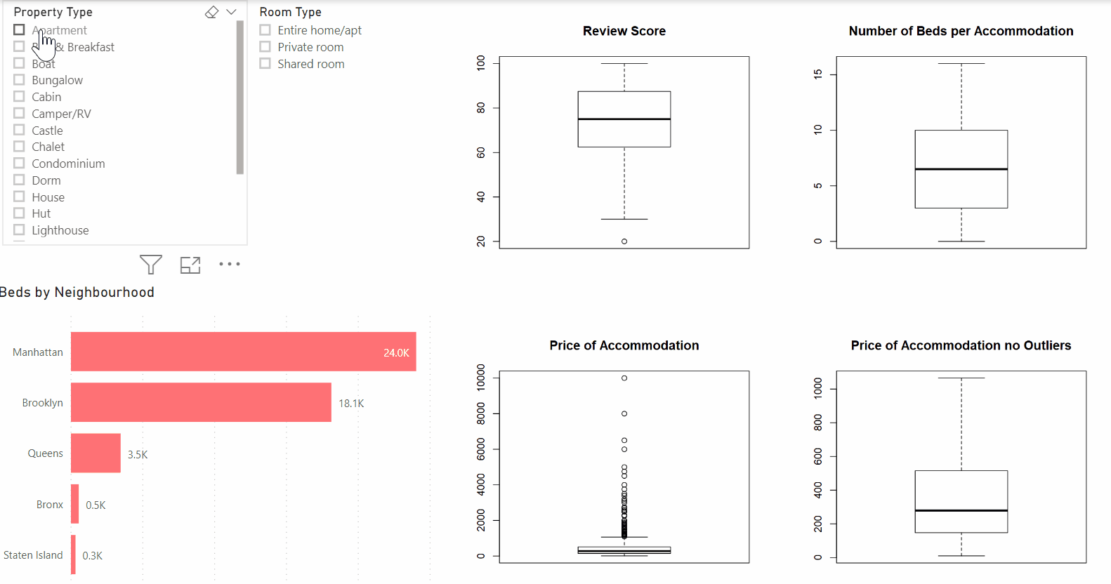
For example, In the dashboard below, you see the powerful combination between Power BI and R in practice. The dashboard consists of multiple Power BI visuals as well as four box plots that were created in R. As you can see, the dashboard remains dynamic and excellent for exploratory purposes. In this example, you are providing your data audience with deeper insights while maintaining the flexibility of Power BI.
But why use R in the first place?
Generally, R provides many benefits when analyzing your data. Firstly, it introduces the world of statistics to your data analyzes. Being unable to perform sophisticated statistical analyzes and predictive analytics such as linear and nonlinear modeling, statistical tests, time-series analysis, classification, clustering is a thing of the past! Subsequently, it doesn’t stop here, because the world of open-source software is now at your fingertips when leveraging R. Overall, There are over 900 R packages available for use in the Power BI with new packages being added regularly. So there is an analytical package for almost any use case.
So what’s next?
Hopefully, I inspired you to start your analytics journey with R. You’ll be surprised which insights you can uncover using this powerful combination. If you want to get started with leveraging R inside PowerBI, be sure to check out the Power BI R Script Showcase and Microsoft’s R in Power BI Documentation to get a head start!
Piqued your interest? Want to know more about performing advanced data analysis using Power BI? Join our Power BI Advanced training!

Gartner Magic Quadrant for Business Intelligence Platforms and Analytics 2020
The Gartner Magic Quadrant for Business Intelligence is a piece of analyst reporting we look forward to every year. Both the dept and the scope of this research makes it worth the read. But not many people take the time to really dig into the details of the report.
Mastering DAX
Keeping your skills up to date is crucial when you work with the newest technology. At Rockfeather, we challenge each other to be the best version of yourself. That’s why I attended the mastering DAX course. DAX (Data Analysis Expressions) is a formula expression language. Next to Power BI, DAX is applied in Excel Power Pivot and tabular models in SQL Server. Learn it once, use it tomorrow.
The Best Data Science Webinars
Day to day hectic is always the enemy of your ambition to acquire new skills and gain knowledge in the fields you identified. These special times offer the opportunity for some of us to spend some extra time to invest in yourself to learn new things. For those of you who have the ambition to learn more about data science we made a selection of the webinars from the people at Alteryx to learn more about this subject.

An interview with author and managing partner of the IBCS Assocation Jürgen Faisst
Recently we had the privilege to attend a workshop by Jürgen Faisst, managing partner of the IBCS Association and co-author of the book SOLID | OUTLINED | HATCHED. After the inspiring workshop, we had the chance to ask him a couple of questions regarding the International Business Communication Standards and his outlook on its future.
What are the International Business Communication Standards?
The International Business Communication Standards (IBCS) are set of rules for the design of reports, presentations and dashboards. These rules cover conceptual aspects. Let’s say the storytelling part and visual aspects like choosing the right chart type, increase information density and apply proper scaling. What sets IBCS apart from all other publications on data visualization? It’s a new class of visual rules covering the consistency of the design. Things that mean the same should always look the same. While this idea was originally invented by Prof. Rolf Hichert. IBCS today is a community-driven Creative Commons project.
Everyone can join the not-for-profit IBCS Association. Contribute to the Standards for free on www.ibcs.com. The idea is to let the business analysts community define their own visual language. Hopefully they will apply it consistently (and tell the software industry to do so).
In your book SOLID | OUTLINED | HATCHED, IBCS is often compared to sheet music. As an avid musician yourself, what are some of the parallels that you see between the world of music and the world of data visualization?
Well, if you step back a little and look at report creation as an act of recording the ideas of a business person on screen or on paper, then you immediately see the parallels. Writing music notes is exactly the same, just with the ideas of a musician. And by the way, creating construction plans is again the same, now with the ideas of an architect.
The difference is: Architects and musicians apply a standard notation when doing so, whereas business analysts just follow their personal preferences or do what they think is best. This is too bad because applying a standard notation does not only speed-up understanding by leveraging pattern recognition, it can even avoid running into issues. Let me give you an example from sheet music: How many keys does the keyboard of a grand piano have? I tell you: It’s 88. 88 different tones that can be played on a piano. Now if you want to these notes down on paper, you have to arrange black dots on and between five lines – this is how music is notated. And you immediately see: 88 notes do not fit into a system of five lines.
Ok, there are assisting lines, and signs for sharp and flat tones. But still: You can probably arrange 50 different tones, but definitely not 88. So we run into a scaling problem. Do we? No, we don’t. Because music notation invented something called clefs. The right hand of a piano player is notated in treble clef, the left hand in bass clef. All musical arrangers apply this rule –not because they see it as the solution to a scaling problem, but because this is the way everyone notates music. Mission accomplished.
What is the best way for a company to start with IBCS?
The best way is to make IBCS part of a project that will redesign reports and dashboards anyway. There are two main situations where this happens: (1) If you replace the BI platform – e.g. you want to use Power BI instead of Cognos, and (2) if the way you run the company changes, e.g. you reorganize control from central to decentral or you just get a new CFO. In these cases implementing IBCS is not an additional project with additional costs, but it facilitates the implementation of a project that is necessary in any case. If you on top of that make sure you’ve got management sponsorship on the subject and an IBCS compliant software in place then your journey toward IBCS will be a smooth one.
Do you have any tips for supporters?
The main tip is: Never argue with your peers that they should apply IBCS because it’s a standard. They do not give a shit about standards. It’s much easier to convince them by just creating better results. They will immediately see that the reports after a makeover are easier to understand. And if they ask what you did in order to achieve that you can smile and tell them: “I’ve simply applied a set of rules making reports better comprehensible. It’s called IBCS. And it’s free and openly available. You want to look at it?” This is the only way to increase adoption. Dogmatism will cause rejection.
You have worked with IBCS for several years now, what is the biggest success story that you can share with us?
There are lots of them, but maybe the biggest success story comes from SAP. The finance department of SAP became aware of IBCS many years ago and Rolf Hichert convinced the former CFO Werner Brandt that applying IBCS to their internal reports would facilitate understanding. So the finance department created some workaround with their own analytic software and redesigned their reports which are now reasonably IBCS compliant.
With the new SAP Analytics Cloud initiative, they have for the first time also taken IBCS principles into account in software development. This led to the IBCS certification of SAP Analytics Cloud in late 2017. Two years later they were recertified with extended IBCS functionality and better usability. This definitely helped raise the perception of IBCS as a mature report design concept.
What is your ultimate dream for IBCS in 3 to 5 years?
Let’s start with my ultimate dream: I would be more than happy to see the same natural use of standard notation in reporting as we see in almost any other discipline. To get there, it will be necessary to incorporate IBCS notation into the curriculum of business schools. 3 to 5 years is probably too short a time frame for this dream to come true. Give us 10 years for education and another 10 years before the students are in management positions. Then it took us a total of 30 years, which is still much faster than in all other disciplines. Musicians have taken centuries.
Want to know more about IBCS? Check out the IBCS section on our website or visit the IBCS website here.

Dashboards with Impact
In my eight years as a consultant, I’ve probably seen more dashboards than I can count. Still, most of them don’t have the impact they should have. Nine out of ten times, people start looking at the data. Is there something wrong with the underlying data-sets? Or is the visual not clear enough? Looking at those elements isn’t bad, but in my opinion, you’re looking in the wrong direction.
Gartner Magic Quadrant for Business Intelligence Platforms and Analytics 2020
The Gartner Magic Quadrant for Business Intelligence is a piece of analyst reporting we look forward to every year. Both the dept and the scope of this research makes it worth the read. But not many people take the time to really dig into the details of the report.
The Best Data Science Webinars
Day to day hectic is always the enemy of your ambition to acquire new skills and gain knowledge in the fields you identified. These special times offer the opportunity for some of us to spend some extra time to invest in yourself to learn new things. For those of you who have the ambition to learn more about data science we made a selection of the webinars from the people at Alteryx to learn more about this subject.

Firstly, in a dynamic and competitive sales organization, achieving and sustaining a competitive advantage hinges upon a comprehensive understanding of the big picture. At its core, this entails a judicious blend of key performance indicators (KPIs) and metrics that span across various facets of the sales process. Notably, sales performance, cost-to-revenue ratios, and quota attainment are among the vital metrics that contribute to forming this all-encompassing perspective.
However, in the modern business landscape, the sheer volume and complexity of data generated within sales operations can be overwhelming. A plethora of data sources, ranging from siloed databases to spreadsheets and customer relationship management (CRM) systems, often create islands of information that make it challenging for organizations to gain valuable insights efficiently.
Finally in this paper, you’ll learn why:
- understanding your data leads to deeper insights in sales analytics;
- a single source of truth helps to get your team on the same page;
- interactive visualizations bring your sales reporting to life;
- shared dashboards support collaboration across your organization;
Download the white paper about sales analytics success here. If you have any further questions, please let us know.
Artificial Intelligence is ready!
In this interview, Jonathan Aardema talks with Prof. Eric Postma (professor of Cognitive Science and Artificial Intelligence at the University of Tilburg) about the why, how, and what of artificial intelligence applications. What do we see in practice, and what does science say about it?
Visiting London for the Tableau Partner Executive Kick-Off 2020
Every year Tableau invites its most valuable partners to kick off the new year together. The theme for this year was Accelerate, so let’s get right to the point. This exciting event was focused on three main areas.
Mastering DAX
Keeping your skills up to date is crucial when you work with the newest technology. At Rockfeather, we challenge each other to be the best version of yourself. That’s why I attended the mastering DAX course. DAX (Data Analysis Expressions) is a formula expression language. Next to Power BI, DAX is applied in Excel Power Pivot and tabular models in SQL Server. Learn it once, use it tomorrow.

Do you want to know how predictive models can help your company make better decisions? Then watch our webinar "Predict churn with Artificial Intelligence". Lots of companies are focusing on getting new customers instead of keeping their existing customer base. Due to these strategies, a lot of customers are hopping from company to company.
The webinar
Keeping existing customers is much cheaper than finding new ones. That is why leading companies are using predictive models, based on patterns in data. With these models, these organizations can focus their efforts to increase loyalty and boost their results.
Do you also want to know which customers will leave your organization? We will show you how to predict this using data but without using complicated technical tools.
Watch our webinar “Predict Churn with Artificial Intelligence,” and you will learn how to get started without needing any programming or coding experience using the toolset of Alteryx.
Program
- Introduction to Artificial Intelligence
- Why churn is more than ever an issue to be dealt with
- Overview Alteryx, user-friendly Data Science platform
- Getting started to set up a churn model
Watch the full webinar
Watch the full webinar in just 30 minutes and learn everything there is to know about Predict Churn with Artificial Intelligence. Just fill out the form and you will get instant access. Don't worry, we won't give your details to anybody else and we won't spam you with non-relevant info.
Predict Churn with Artificial Intelligence
Watch the full webinar in just 30 minutes and know everything there is to know about Predict Churn with Artificial Intelligence.
-
Predict Churn with Artificial Intelligence

Artificial Intelligence is ready!
In this interview, Jonathan Aardema talks with Prof. Eric Postma (professor of Cognitive Science and Artificial Intelligence at the University of Tilburg) about the why, how, and what of artificial intelligence applications. What do we see in practice, and what does science say about it?

Gartner's Magic Quadrant for Data Science and Machine Learning Platforms
Are you looking for a Data Science and Machine Learning solution? Then Gartner’s Magic Quadrant for data science and machine learning platforms is a valuable resource. A lot of people only look at the famous 2-by-2-matrix, but there is much more than just this matrix. That’s why we dug into the dirty details of the full report and put all this into a 20-minute webinar. In this webinar, we will show you all the vendors that are scored as a leader in Gartner’s 2020 Magic Quadrant for Data Science and Machine Learning Platforms.
The Best Data Science Webinars
Day to day hectic is always the enemy of your ambition to acquire new skills and gain knowledge in the fields you identified. These special times offer the opportunity for some of us to spend some extra time to invest in yourself to learn new things. For those of you who have the ambition to learn more about data science we made a selection of the webinars from the people at Alteryx to learn more about this subject.

Preventing churn for more loyal customers, that’s the dream
There is one thing that’s just as important as finding new clients: keeping your current clients. This blog will give you some practical tips to increase your loyal customer group!
First things first, we need to get insights into our customers. What are the characteristics of our loyal customers, and maybe more important, what are these characteristics of the customers that’ll probably leave our organization?
Lots of companies are focusing on getting new customers instead of keeping their existing customer base. For example, why are gyms and telecom providers only giving a discount to their new customers, and not to their current customers? Due to these strategies, a lot of customers are hopping from company to company, which won’t lead to a loyal customer base.
Recognizing characteristics
In this blog, we’ll go into the practical way of creating insights in the customers that most probably will leave your organization within a period. These customers are going to churn, so from now on, we’ll call them churners.
Getting a list of your future churners is incredibly valuable to your business. You could give them a little bit extra TLC (tender, love & care) or a discount, depending on which marketing strategy is the best fit for each churner, to make sure that these churners won’t leave.
We need to do some study so we can say which factors are most important for customers to become a churner. To do this research, we’ll work with Alteryx, which is an easy low-coding application to investigate your business’ data. Important to note is that you don’t need any code/programming skills to understand this blog. We’ll keep it clean and simple, to give you the information to start your analytical churners journey!
To investigate which of these factors are essential, we’ll do some research on the data of formal churners and not-churners. For now, we’ll use our business’ data from the last three years. In this data, we’ll try to discover some (hidden) patterns in the customer’s behavior that separate the churners from the not-churners. For example, you might find that almost all the churners filed a complaint in the last six months of being a customer of your business. This might indicate the follow up of the presented claims is terrible, which leads to a lot of churners.
Predictive churn
Within Alteryx, we’ll use the preparation tools to clean and enrich the data. When these steps are finalized, we have well-structured data, which can be analyzed by the predictive models. These models are training themselves by looking for patterns. Once these patterns are discovered, the model will deploy these patterns on our new data. This new data exists in our current customer base. We want to check if some existing customers behaving like one of the churners in the past so that we could alert the account managers.
By knowing which customers are most likely to churn, we could prevent all these customers from churning. By doing this over and over, you know when it’s time to give them some extra TLC.
Conclusion
Preventing churn isn’t that hard; you need to be consistent. If you give some extra TLC from time to time, your consistency will win in the end. Knowing which customers are likely to churn not only brings in extra money, it can change your business model. If you reward your loyal customers on a regular base, you don’t need to spend a fortune on finding new customers.
In our next blog, we will go deeper into the details of churn prediction.
Free webinar
Do you want to know how predictive models can help your company make better decisions? Then register for our webinar “Predict churn with artificial intelligence” on the 17th of June. Lots of companies are focusing on getting new customers instead of keeping their existing customer base. Due to these strategies, a lot of customers are hopping from company to company. View the webinar page or sign up directly below!
Sign up for our free webinar!
Thank you for your registration!
Artificial Intelligence is ready!
In this interview, Jonathan Aardema talks with Prof. Eric Postma (professor of Cognitive Science and Artificial Intelligence at the University of Tilburg) about the why, how, and what of artificial intelligence applications. What do we see in practice, and what does science say about it?
Visiting London for the Tableau Partner Executive Kick-Off 2020
Every year Tableau invites its most valuable partners to kick off the new year together. The theme for this year was Accelerate, so let’s get right to the point. This exciting event was focused on three main areas.
Mastering DAX
Keeping your skills up to date is crucial when you work with the newest technology. At Rockfeather, we challenge each other to be the best version of yourself. That’s why I attended the mastering DAX course. DAX (Data Analysis Expressions) is a formula expression language. Next to Power BI, DAX is applied in Excel Power Pivot and tabular models in SQL Server. Learn it once, use it tomorrow.