
Do You Really Have a Single Source of Truth? Test Your SSOT Maturity
A Single Source of Truth. It sounds like the ultimate goal in data-driven organizations. But what does it actually mean? And more importantly: Is your organization steering with one clear compass, or quietly navigating with multiple truths? In this benchmark, you'll discover how mature your SSOT is and what steps you can take to improve it.
A Single Source of Truth (SSOT) is not just a central data repository or data warehouse. It means that your organization has one reliable source where all data is consistent, controlled, and accessible for decision-making. A SSOT includes both technology and processes, ensuring that the right data is available at the right time. Think of standardized definitions, clear ownership, integrated systems, a central source for output, and automatic quality controls.
A SSOT ensures that you are not working with multiple truths or outdated information scattered across systems, but that everyone is using the same, up-to-date data to make decisions. It forms the foundation for reliable and efficient management of your organization.
In the video below, Robert Donker explains the most important capabilities of a SSOT, why it is essential, and how you can accurately assess the current state of your organization.
Take the SSOT Maturity Benchmark: test how things actually are within your organization. You will assess your data landscape from both the technology and process perspectives. This benchmark is based on current leading frameworks for data governance and maturity, such as DAMA-DMBOK, DCAM, and CMMI, combined with our own experience with over 170 clients. Through this benchmark, you will gain insight into where you stand and the steps you can take to further improve your SSOT.


Process Automation Playbook: this is what you can automate with Power Platform
You already know automation can make a difference. You have seen demos, read case studies, and maybe even built your first app. Still, it’s hard to decide where you can actually create the most value right now. Not because the technology is complex, but because there is no clear overview to properly assess and prioritize opportunities.
Until now.
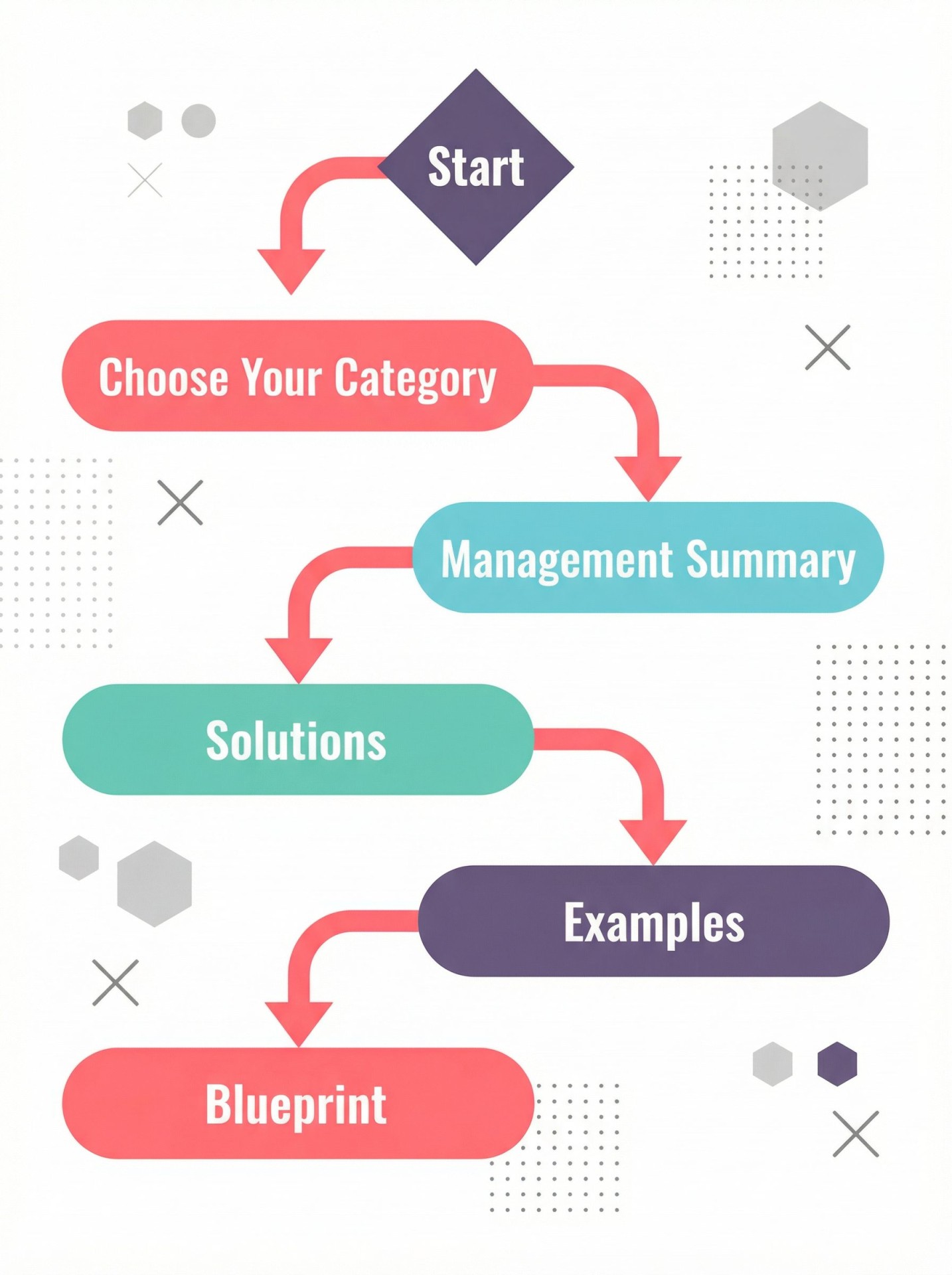
We have brought together all relevant Process Automation possibilities with Power Platform into a clear, step‑by‑step Playbook. It’s structured entirely around how you think: starting with your goal and ending with a concrete blueprint of your ideal solution. A practical framework that helps you decide where to start tomorrow.
Which processes can be automated?
We have grouped the most important Process Automation use cases with Power Platform into six capabilities. For each category, we show the most common solutions and what they look like in real-world scenarios:
- Reduce manual work and coordination
- Gain control and visibility over your processes
- Improve data consistency and reliability
- Build and modernize business applications
- Connect and extend your existing systems
The final chapter covers the last essential capability of Process Automation: scaling with governance. It explains the core elements required to grow automation safely and in a controlled way.
How does your organization take the next step in Process Automation?
The Playbook guides you step by step in defining the next automation to focus on. You start by selecting the capability that best fits your current situation. At Level 1, you get a clear management summary: the problem at hand, which parts of the Power Platform address it, and the concrete value it delivers. Level 2 takes this a step further, showing which applications you can build, how the different Power Platform components work together, and what this looks like in practice, supported by clear examples and a complete architecture blueprint.
Below, you find a short video explaining how to use the Playbook, so you can move from insight to action as quickly as possible.
Sign up and get the Process Automation Playbook
Watch the webinar, fill in the form, and receive the full Playbook instantly. That way, you can sit down with your team today and decide where to begin.
Watch this webinar instantly:


Webinar: How to keep your data landscape running reliably?
Your data solutions are live and actively used across the organization. That usually leads to more demand and higher expectations. Growth is good, but it also has a downside. Your data landscape needs to keep running reliably every day.
Most data environments grow organically. It starts with a few dashboards, then a data platform, and suddenly you’re flooded with business requests. Technically it works, but operationally? It’s chaos.
Everything feels urgent. Ownership is a gray area. Improvements are constantly postponed. Your team is reactive, and knowledge stays trapped in people’s heads instead of processes. What started as an investment in better decision-making is now a machine that requires constant manual labor just to stay afloat.
Build a foundation that scales, for a reliable data landscape
The only way out is to organize support and operations by design. In this 20-minute session, Germen shows you how to move from “hero-based” support to a scalable framework.
What we will cover:
🎯 The Ad-Hoc Trap: Why data teams get stuck in reactive “firefighting.”
📊 Data Ops & ITIL: How to apply proven ITIL frameworks to bring stability to data.
🚀 Pragmatic Governance: What to formalize now and what can wait.
💡 The Roadmap: Practical first steps to break the cycle and regain control.
To view this webinar, just scroll down a bit
And after this webinar?
After watching this webinar, you have three options to stabilize your data environment:
- Do nothing: Keep firefighting and hope the backlog disappears on its own.
- Do it yourself: Use the ITIL principles from this webinar to build your own framework.
- Do it with Rockfeather: See how Rockfeather Support ensures continuity, so your team can focus on innovation instead of maintenance.
Watch this webinar instantly:


Solid Talk: State-of-the-Art Reporting – Insights from Industry Leaders
Want to learn from the minds shaping the future of data reporting? In this exclusive Solid Talk, Jürgen (IBCS), Andrej (Zebra BI), and Paul (Rockfeather) reveal how standardization, AI, and best practices are revolutionizing reporting. Discover the impact they’ve made—and how you can apply their insights to your own organization.
Business leaders rely on dashboards and KPIs, yet many companies still struggle with data silos, inconsistent reporting, and misaligned KPIs that don’t drive strategic decisions. AI promises a lot, but how do you harness it without adding unnecessary complexity?
Join Rockfeather co-founder Paul Damen as he sits down with industry pioneers to explore how standardization and AI can help companies make faster, smarter, and more confident decisions.
Meet the Experts:
- Jürgen Faisst – Founder of IBCS, expert in business communication and data standardization
- Andrej Lapajne – Founder of Zebra BI, specialist in visual reporting and impactful dashboards.
- Paul Damen – co-founder of Rockfeather, cutting-edge theory with practical insights.
What you’ll learn:
📊 How standardization eliminates noise and sharpens insights.
🎯 What top-performing companies get right with IBCS and Zebra BI.
🚀 AI in reporting: when it truly adds value-and when it doesn’t.
And after this webinar?
You’ve got three clear options:
1. Keep doing what you’re doing
Stick to your current dashboard setup, design by design, team by team.
It works… sort of. Until it doesn’t.
2. Start implementing IBCS yourself
Want to roll up your sleeves and bring visual consistency intor your reports?
The Zebra BI plug-in makes it easy to apply IBCS principles in Power BI.
👉 Get started with Zebra BI
3. Sharpen your KPI’s with Rockfeather
Before you optimize the layout, let’s make sure you’re measuring the right things.
We help you connect your dashboards to real business goals-so you’re not just reporting, you’re steering.
👉 Book a KPI session with us
Webinar: Why are 1990s processes dictating your 2026 ambitions?
Your team is too valuable for temporary solutions. Yet, your best professionals spend hours repairing spreadsheets and chasing approvals via email. It is a waste of their talent and your budget.
Yet, this is often the reality. While you have ambitions to scale, your operational backbone is held together by ‘manual glue’. Complex spreadsheets and endless email chains are slow, error-prone, and ultimately a waste of human capital.
What you really need is a team that can scale and make decisions faster. You need applications that take manual work off their plate. It is the only way to let your team do what they were hired for: adding value.
What if you already have the tools to fix this?
During this webinar, Rudimar demonstrates how to make that shift. You will learn how to digitize processes quickly and securely with Power Apps, without getting stuck in a multi-year IT project.
Rudimar explains why:
- Manual processes are a strategic risk. Every human touchpoint in your data flow is a potential error and a guaranteed delay.
- Automation is about more than saving time. It brings control, governance, and a waterproof audit trail.
- Power Apps is the key. You can professionalize and digitize your operations without launching a massive IT transformation.
What you will learn:
- Strategic Necessity: Why automation belongs on the boardroom agenda right now.
- Agility without Chaos: How to create speed without adding complexity to your IT landscape.
- The First Step: How to start building scalable, audit-proof processes today.
- AI as an Accelerator: How AI makes your workflows smarter (without the risk of ‘black box’ decisions).

KPI Blueprint webinar – Including access to exclusive template
Many organizations manage dozens of KPIs. They’re tracked, reported… but do they actually lead to better results? In reality, not always.
In this exclusive webinar, Jonathan Aardema shows you how to regain focus with KPIs that truly matter.
During this webinar, you’ll discover how the KPI Blueprint helps you connect KPIs to both your strategy and data structure in a meaningful way. A practical framework designed to drive action. And the best part: upon registration, you’ll gain immediate access to the exclusive KPI Blueprint Template with KPI Tree, ready to use in your own organization.
About this KPI Blueprint webinar
The KPI Blueprint is designed to help organizations move from vague ambitions to measurable steering. In just 25 minutes, Jonathan Aardema will show you how to:
- Align KPIs with strategic and tactical goals
- Gain clarity on what to measure—and what not to
- Use data effectively to guide smarter decisions
- Prevent your organization from getting lost in dashboards and details
What you’ll gain from this KPI Blueprint webinar
By the end of the session, you’ll be ready to take action. You’ll know how to define sharper KPIs, identify your real priorities, and recognize where your biggest opportunities lie. Plus, you’ll receive exclusive access to the KPI Blueprint Template—a practical, structured tool that connects your strategy, KPIs, and data in one place.
Watch this webinar:
What’s included in the KPI Blueprint Template?
Based on the proven ROKS method, this template gives you a clear and visual way to build your KPI framework. The workbook includes:
- Strategic and tactical levels
- Fields for goals, targets, data sources, and ownership
- A visual KPI Tree to keep everything focused and structured
Your next steps?
After viewing the KPI Blueprint webinar and submitting the form below, you’ll receive the full workbook, so you can immediately apply what you’ve learned in your own context. Want to really get to work on these topics? Get in touch with Alexander via alexander.mik@rockfeather.com.

8 quick sessions to learn what is next in Data and Automation
From low-code apps to solid data pipelines and AI: get a full picture of today’s essential technologies in short, actionable videos.
Short on time, but ready to strengthen your data foundation?
Explore eight concise sessions that help you connect, automate, and visualize data with today’s most relevant Microsoft and low-code technologies.
These 20-minute videos combine technical depth with practical insight, giving you both the why and the how of modern data strategy.
Why watch these sessions
Modern organizations run on data. Yet many teams still struggle to translate potential into results — overwhelmed by the number of tools, features, and platforms.
That’s why we created these on-demand masterclasses: to give you clarity in a fast-changing landscape.
You’ll learn:
- How to automate repetitive work with Power Automate and Logic Apps
- How PowerApps accelerates app development without heavy coding
- How to design IBCS-compliant dashboards in Power BI and Zebra BI
- When to choose Microsoft Fabric or Databricks for scalable data integration
- How to modernize your architecture with an Azure data back-end
- What AI Agents and Copilot can (and cannot) do for working more efficient
- How TimeXtender enables governed, low-code data warehousing
Each session is led by experts who work daily with these technologies, sharing proven patterns, pitfalls to avoid, and real-life examples from enterprise environments.
Who it’s for
These on-demand sessions are designed for:
- Data and IT managers who want to modernize their architecture.
- Business analysts looking to automate manual processes.
- Developers and engineers eager to explore low-code tools and AI frameworks.
No matter where you are in your data maturity journey, you’ll find practical next steps to increase efficiency and impact.

Start watching now
-
Watch now
From Solid Tech to Business Impact
Start with Jonathan’s one-minute introduction on how solid technology translates into real business impact. A clear, practical kick-off for all sessions that follow.
-
Watch now
PowerApps – Build Business Apps Without Coding
Discover how to turn ideas into working apps in hours, not weeks. Learn how PowerApps enables teams to digitize workflows and improve collaboration without deep development skills.
-
Watch now
TimeXtender – Low-code Data Warehousing
Automate data modeling and create governed, scalable pipelines with a low-code approach. See how to accelerate development while keeping control.
-
Watch now
Copilot & AI Agents – Practical AI in Action
Discover how Copilot and AI Agents help automate decision-making, content creation, and reporting. You’ll see what’s already possible today, how to start small, and what’s needed to implement AI responsibly within your organization.
-
Watch now
Azure Data Platform – A Solid Foundation for Growth
Learn the essentials of cloud-based data storage, integration, and analytics, and how to connect Azure services into one reliable data ecosystem. Build once, grow endlessly.
-
Watch now
Microsoft Fabric – Integrate and Analyze at Scale
Get a clear overview of Microsoft Fabric, the new unified data platform. Learn how it simplifies your analytics landscape by connecting data movement, transformation, and visualization in one end-to-end service.
-
Watch now
Databricks – Unified Data and AI Platform
See how Databricks brings data engineering, analytics, and AI together in one environment. Learn how to streamline data pipelines, reduce data duplication, and create a single source of truth for faster insights.
-
Watch now
Power BI with Zebra BI & IBCS – Solid Dashboarding
This session covers IBCS design standards and Zebra BI techniques to make your reports clear, consistent, and visually powerful. Go beyond beautiful visuals, focus on insights that make an impact.
-
Watch now
Power Automate – Smarter Workflows, Less Manual Work
Power Automate helps you save time and reduce errors. Learn patterns and best practices that make automation both reliable and scalable.

Data Adoption, Done Right: Tips That Stick
You’ve invested in a great data solution. In the first few months, everything works perfectly, and the team is excited. But after a while, cracks start to appear: reports load slowly, refreshes fail, or reports aren’t used at all. Sound familiar?
Successful data adoption is more than just getting started. It’s about sustained use and stable performance.
About this webinar
In this short but powerful webinar, we’ll show you how to successfully embed data solutions in your organization—and how to prevent them from losing effectiveness over time. You’ll get practical, actionable tips from real cases and learn how our support team can help ensure continuity.
We’ll cover:
- What data adoption really means (and why it often fails)
- Practical tips that actually work in the field
- How to keep your solutions healthy: common issues and how to avoid them
- When it makes sense to engage our support team
What’s in it for you
In just 20 minutes, you’ll learn:
- How to accelerate adoption within your team
- How to prevent technical issues before they impact you
- How to keep dashboards and reports consistently valuable
Want your data solutions not just to launch, but keep running smoothly? Watch this webinar now and discover how we can help.
Rewatch this webinar?
Watch the webinar recording and apply the lessons to your current roadmap


Solid talk: From ‘having data’ to ‘using data’ with Schiphol’s Chief of Data
Jonathan Aardema (Co-Founder, Rockfeather) sits down with Maarten van den Outenaar, Chief of Data at Schiphol, for a straight-talk session on data strategy with impact. They talk about field-tested practices, honest pitfalls, and concrete examples you can lift into your own roadmap the same week.
Why many data strategies stall
Big ambitions die in execution when teams ship impressive prototypes that users don’t adopt, or when priorities drift away from business goals. Maarten shares the tell-tale signals:
- Teams can’t name the user, the decision, or the measurable outcome.
- Success looks like “we built it,” not “it’s used and it improved X.”
- Initiatives run in silos, costs climb, benefits aren’t captured.
Bottom line: strategy only matters if it’s executed—and used.
What actually works in practice
From rail and construction to aviation, the patterns repeat. The wins come when you:
- Anchor to business outcomes – tie every data product to a concrete operational or commercial goal.
- Design for adoption, not just accuracy – remove friction in the real context of work (sometimes that means paper, not a tablet on a vibrating machine).
- Keep the human in the loop – automate the boring, elevate expert judgment where it adds value.
- Focus on rate of adoption, not rate of change – pace your roadmap to what the organization can truly absorb.
Example discussed: repurposing advanced computer vision from a long-horizon R&D track into a maintenance use case that delivered immediate, visible value for front-line teams.
How to align teams and reduce waste
Great data teams can build almost anything; great strategies help them build the right things:
- Translate corporate strategy into a clear portfolio of data products.
- Set explicit user, decision, and metric for each product.
- Cut duplication across teams; standardize where it saves time; differentiate where it drives impact.
Keeping it alive after the first quarter
Momentum fades unless you make progress visible and leaders accountable:
- Publish a simple “highlight report” every half-year mapping business objectives → data products → realized outcomes.
- Practice radical transparency with sponsors – what’s used, what’s not, and what stops.
- Codify ownership in the business – adoption, feedback, and action live there, not just in the data team.
When you should watch this
If you lead data, analytics, or IT and want your investments to show up in operational KPIs—not only in demos—this conversation gives you the playbook and the pitfalls to avoid.
What you’ll take away in 20 minutes
- How to link data products to real business goals and user decisions.
- How to diagnose adoption gaps fast—and fix them.
- How to pace your roadmap to organizational absorption.
- How to make value visible so sponsorship and momentum stick.
Rewatch this webinar?
Watch the webinar recording and apply the lessons to your current roadmap